Download PDF


What is Power BI?
Power BI was introduced by Microsoft to combine the multiple data visualization features into one. Power BI is the new term for the data-driven industry and thus carries a lot of opportunities on its shoulders. It comes as a package of three major components:
- Power BI services
- Power BI Desktop
- Power BI mobile app
With these three components, Power BI lets you create a data-driven insight into your business. Based on various roles, you can leverage Power BI to your benefits like creating reports, monitor progress, integrate APIs, and many more.
Why Power BI?
Power BI has simplified the workaround of getting data from various sources and collating them into one tool for proper management. We can share these interactive reports for different industries like retail, for free.
Power BI is the new flash word in the data-driven tech industry today. The power BI opportunities are umpteen and spread across versions. With proper knowledge of the tool you can easily grab opportunities as a:
- Power BI data analyst
- Power BI developer
- Power BI software engineer
- Power BI project manager
- SQL Server Power BI developer
- Power BI consultant
With good compensation, you get to work with a product’s data and learn about its insights to make important decisions. Not just this, with the latest Gartner’s BI and Analytics report, Power BI has emerged as the winner. With so much hype, learning Power BI is worth it.
In today's article, we will be looking at the interview questions on Power BI from basic, intermediate, to advanced levels.
Power BI Interview Questions For Freshers
1. What are the major components of Power BI?
Power BI is an amalgamation of these major components:
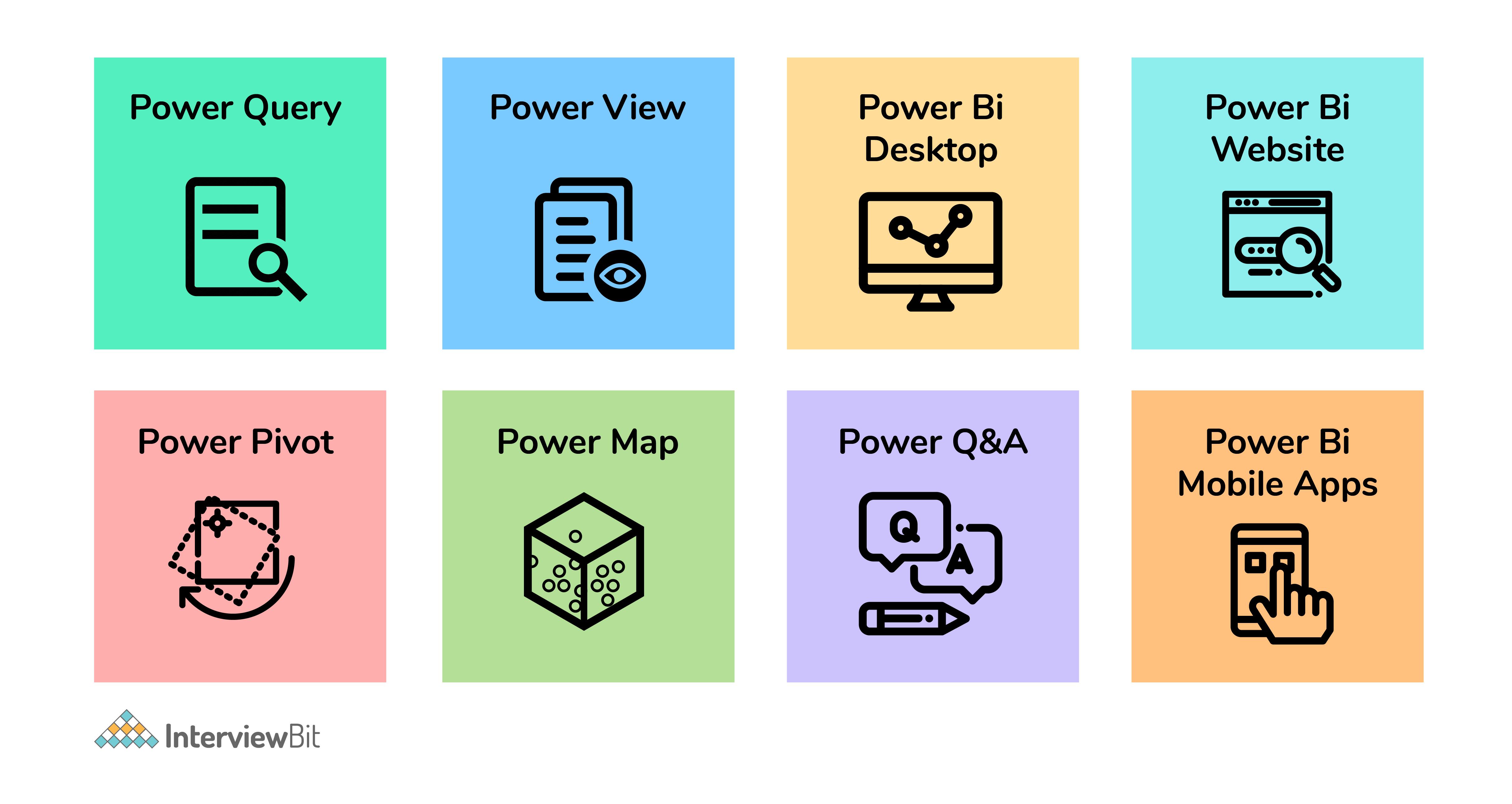
- Power Query (for data mash-up and transformation): You can use this to extract data from various databases (like SQL Server, MySql, and many others ) and to delete a chunk of data from various sources.
- Power Pivot (for tabular data modeling): It is a data modeling engine that uses a functional language called Data Analysis Expression (DAX) to perform the calculations. Also, creates a relationship between various tables to be viewed as pivot tables.
- Power View (for viewing data visualizations): The view provides an interactive display of various data sources to extract metadata for proper data analysis.
- Power BI Desktop (a companion development tool): Power Desktop is an aggregated tool of Power Query, Power View, and Power Pivot. Create advanced queries, models, and reports using the desktop tool.
- Power BI Mobile (for Android, iOS, Windows phones): It gives an interactive display of the dashboards from the site onto these OS, effortlessly.
- Power Map (3D geo-spatial data visualization).
- Power Q&A (for natural language Q&A).


 Real-Life Problems
 Prep for Target Roles
 Custom Plan Duration
2. What are the various refresh options available?
Four main refresh options are available in Power BI:
- Package/OneDrive refresh: This synchronizes Power BI desktop or Excel file between the Power BI service and OneDrive
- Data/Model refresh: This means scheduling the data import from all the sources based on either refresh schedule or on-demand.
- Tile refresh: Refresh the tiles’ cache on the dashboard every time the data changes.
- Visual container refresh: Update the reports’ visuals and visual container once the data changes.
3. What are the different connectivity modes in Power BI?
The three major connectivity modes in Power BI are:
Direct Query: The method allows direct connection to the Power BI model. The data doesn’t get stored in Power BI. Interestingly, Power BI will only store the metadata of the data tables involved and not the actual data. The supported sources of data query are:
- Amazon Redshift
- Azure HDInsight Spark (Beta)
- Azure SQL Database
- Azure SQL Data Warehouse
- IBM Netezza (Beta)
- Impala (version 2.x)
- Oracle Database (version 12 and above)
- SAP Business Warehouse (Beta)
- SAP HANA
- Snowflake
- Spark (Beta) (version 0.9 and above)
- SQL Server
- Teradata Database
Live Connection: Live connection is analogous to the direct query method as it doesn’t store any data in Power BI either. But opposed to the direct query method, it is a direct connection to the analysis services model. Also, the supported data sources with live connection method are limited:
- SQL Server Analysis Services (SSAS) Tabular
- SQL Server Analysis Services (SSAS) Multi-Dimensional
- Power BI Service
Import Data (Scheduled Refresh): By choosing this method, you upload the data into Power BI. Uploading data on Power BI means consuming the memory space of your Power BI desktop. If it is on the website, it consumes the space of the Power BI cloud machine. Even though it is the fastest method, the maximum size of the file to be uploaded cannot exceed 1 GB until and unless you have Power BI premium (then you have 50 GB at the expense).
But which model to choose when depends on your use and purpose.
4. What is a Power BI desktop?
To access the Power BI features, visualize data, or model them to create reports, you can simply download a desktop version of Power BI. With the desktop version, you can extract data from various data sources, transform them, create visuals or reports, and share them using Power BI services.
5. Where is the data stored in Power BI?
Primarily, Power BI has two sources to store data:
Azure Blob Storage: When users upload the data, it gets stored here.
Azure SQL Database: All the metadata and system artifacts are stored here.
They are stored as either fact tables or dimensional tables.

6. What are the available views?
In power BI, you have various kinds of views viz:
- Data View: Curating, exploring, and viewing data tables in the data set. Unlike, Power Query editor, with data view, you are looking at the data after it has been fed to the model.
- Model View: This view shows you all the tables along with their complex relationships. With this, you can break these complex models into simplified diagrams or set properties for them at once.
- Report View: The report view displays the tables in an interactive format to simplify data analysis. You can create n number of reports, provide visualizations, merge them, or apply any such functionality.
7. What are the available formats?
Power BI is available in various formats:
- Power BI desktop: For the desktop version
- Power BI mobile app: For using the visualizations on mobile OS and share it
- Power BI services: For online SaaS


 Topic Buckets
 Mock Assessments
 Reading Material
 Earn a Certificate
8. Power BI can connect to which data sources?
The data source is the point from which the data has been retrieved. It can be anything like files in various formats (.xlsx, .csv, .pbix, .xml, .txt etc), databases (SQL database, SQL Data Warehouse, Spark on Azure HDInsight), or form content packets like Google Analytics or Twilio.
9. How would you define Power BI as an effective solution?
Power BI is a strong business analytical tool that creates useful insights and reports by collating data from unrelated sources. This data can be extracted from any source like Microsoft Excel or hybrid data warehouses. Power BI drives an extreme level of utility and purpose using interactive graphical interface and visualizations. You can create reports using the Excel BI toolkit and share them on-cloud with your colleagues.
Power BI Intermediate Questions
1. What is a dashboard?
The dashboard is like a single-page canvas on which you have various elements to create and visualize reports created by analyzing data. It comprises only the most important data from the reports to create a story.
The visual elements present on the dashboard are called Tiles. You can pin these tiles from the reports to the dashboard. Clicking any element on the dashboard takes you to the report of a particular data set.
2. What are the building blocks of Power BI?
The major building blocks of Power BI are:
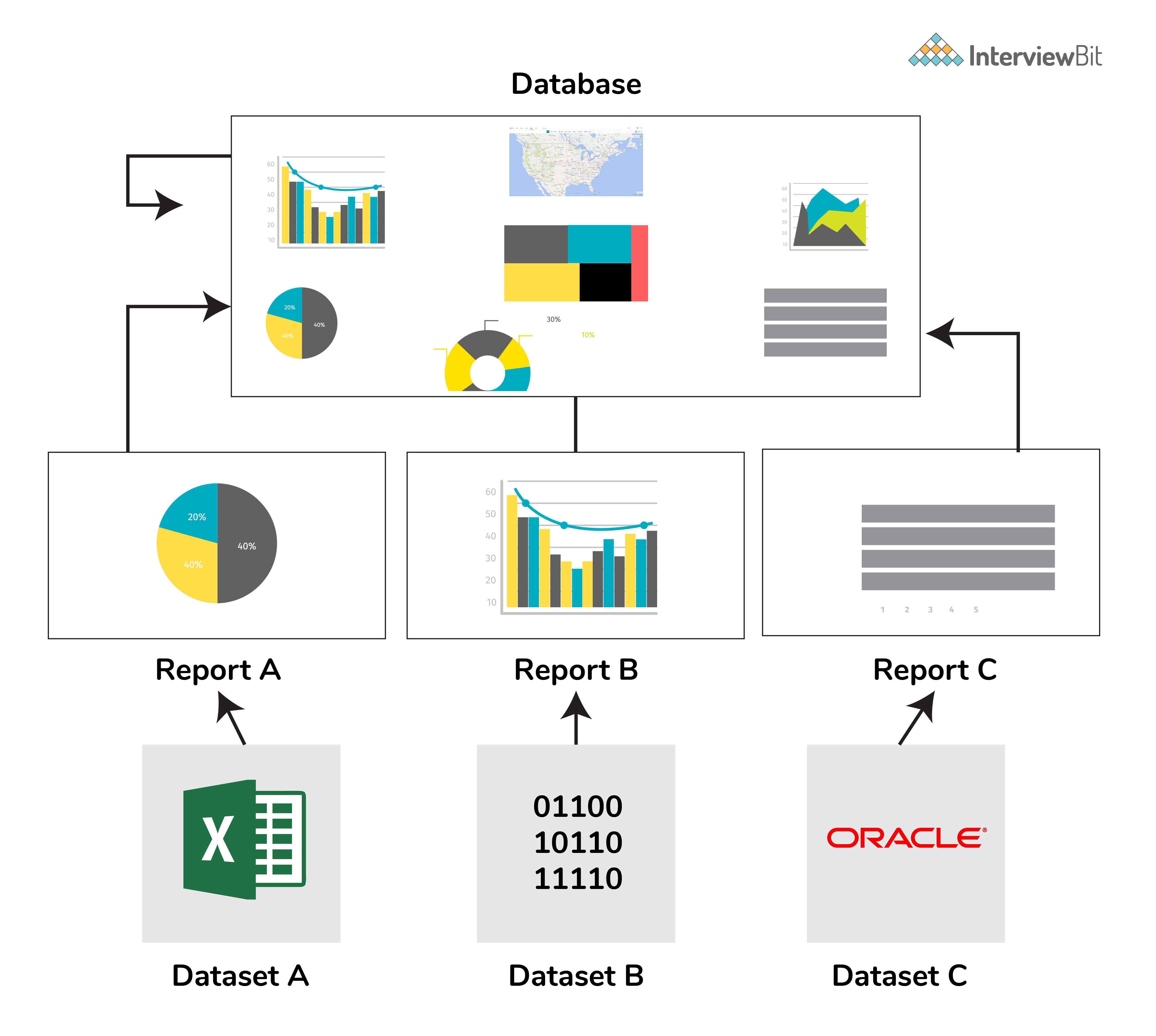
- Datasets: Dataset is a collection of data gathered from various sources like SQL Server, Azure, Text, Oracle, XML, JSON, and many more. With the GetData feature in Power BI, we can easily fetch data from any data source.
- Visualizations: Visualization is the visual aesthetic representation of data in the form of maps, charts, or tables.
- Reports: Reports are a structured representation of datasets that consists of multiple pages. Reports help to extract important information and insights from datasets to take major business decisions.
-
Dashboards: A dashboard is a single-page representation of reports made of various datasets. Each element is termed a tile.
Tiles: Tiles are single-block containing visualizations of a report. Tiles help to differentiate each report.
3. What are content packs in Power BI?
Content packs are packages comprising different Power BI objects such as reports, dashboards, datasets, etc. The two types of content packs are:
Service provider content packs: Service providers such as Google Analytics, Salesforce, etc. provide pre-built content packages
User-created content packs: Users can create their content packages and share them within the organization.

 Interview Process
 CTC & Designation
Projects on the Job
CTC & Designation
Projects on the Job
 2 Lakh+ Roadmaps Created
4. What are the various Power BI versions?
The three major versions of Power BI are as follows:
- Power BI Desktop: The free interactive tool that connects multiple data sources, transforms data, and creates visualized reports.
- Power BI Premium: The premium version is used for larger organizations with a dedicated storage capacity for each user. With premium, data sets up to 50GB storage capacity can be hosted along with 100TB storage on the cloud as a whole. It costs $4995 per month.
- Power BI Pro: With the pro version, you get full access to the Power BI dashboard, creation of reports, along with unlimited sharing and viewing of reports. You also have a storage limit of 10GB per user.
5. What is DAX?
Data Analysis Expression (DAX) is a library of formulas used for calculations and data analysis. This library comprises functions, constants, and operators to perform calculations and give results. DAX lets you use the data sets to their full potential and provide insightful reports.
DAX is a functional language containing conditional statements, nested functions, value references, and much more. The formulas are either numeric (integers, decimals, etc.) or non-numeric (string, binary). A DAX formula always starts with an equal sign.

A: Name of the project
B: Start of the DAX formula
C: DAX function (to add)
D: Parentheses defining arguments
E: Name of the table
F: Name of the field
G: Operator
6. What are the purpose and benefits of using the DAX function?
DAX is much more than Power BI. If you learn DAX as a functional language, you become better as a data professional. DAX is based on different nested filters which magnificently improves the performance of data merging, modeling, and filtering tables.
7. What is Power Pivot?
Power Pivot enables you to import millions of rows from heterogeneous sources of data into a single excel sheet. It lets us create relationships between the various tables, create columns, calculate using formulas, and create PivotCharts and PivotTables.
At a time there can be only one active relationship between the tables which is represented by a continuous line.
8. What is Power Query?
Power query is a function that filters transforms, and combines the data extracted from various sources. It helps to import data from databases, files, etc and append data
9. Difference between Power BI and Tableau?
The major differences between Power BI and Tableau are:
- While Power BI uses DAX for calculating columns of a table, Tableau uses MDX (Multidimensional Expressions).
- Tableau is more efficient as it can handle a large chunk of data while Power BI can handle only a limited amount.
- Tableau is more challenging to use than Power BI.
10. What is GetData in Power BI?
GetData offers data connectivity to various data sources. Connect data files on your local system. The supported data sources are:
- File: Excel, Text/CSV, XML, PDF, JSON, Folder, SharePoint.
- Database: SQL Server database, Access database, Oracle database, SAP HANA database, IBM, MySQL, Teradata, Impala, Amazon Redshift, Google BigQuery, etc.
- Power BI: Power BI datasets, Power BI dataflows.
- Azure: Azure SQL, Azure SQL Data Warehouse, Azure Analysis Services, Azure Data Lake, Azure Cosmos DB, etc.
- Online Services: Salesforce, Azure DevOps, Google Analytics, Adobe Analytics, Dynamics 365, Facebook, GitHub, etc.
- Others: Python script, R script, Web, Spark, Hadoop File (HDFS), ODBC, OLE DB, Active Directory, etc.
11. What are filters in Power BI?
Filters sort data based on the condition applied to it. Filters enable us to select particular fields and extract information in a page/visualization/report level. For example, filters can provide sales reports from the year 2019 for the Indian region. Power BI can make changes based on the filters and create graphs or visuals accordingly. Types of filters are:
- Page-level filters: These are applied on a particular page from various pages available within a report.
- Visualization-level filters: These are applied to both data and calculation conditions for particular visualizations.
- Report-level filters: These are applied to the entire report.
Power BI Interview Questions For Experienced
1. What do we understand by Power BI services?
Power BI provides services for its cloud-based business analytics. With these services, you can view and share reports via the Power BI website. Power BI is a web-based service for sharing reports. Power BI service can be best referred to as PowerBI.com, PowerBI workspace, PowerBI site, or PowerBI portal.
2. What are the types of visualizations in Power BI?
Visualization is a graphical representation of data. We can use visualizations to create reports and dashboards. The kinds of visualizations available in Power BI are Bar charts, Column charts, Line chart, Area chart, Stacked area chart, Ribbon chart, Waterfall chart, Scatter chart, Pie chart, Donut chart, Treemap chart, Map, Funnel chart, Gauge chart, Cards, KPI, Slicer, Table, Matrix, R script visual, Python visual, etc.
3. What is the comprehensive working system of Power BI?
Power BI’s working system mainly comprises three steps:
- Data Integration: The first step is to extract and integrate the data from heterogeneous data sources. After integration, the data is converted into a standard format and stored in a common area called the staging area.
- Data Processing: Once the data is assembled and integrated, it requires some cleaning up. Raw data is not so useful therefore, a few transformation and cleaning operations are performed on the data to remove redundant values, etc. After the data is transformed, it is stored in data warehouses.
- Data Presentation: Now that the data is transformed and cleaned, it is visually presented on the Power BI desktop as reports, dashboards, or scorecards. These reports can be shared via mobile apps or web to various business users.
4. What are custom visuals in Power BI?
Using Power BI visualizations, you can apply customized visualizations like charts, KPIs, etc. from the rich library of PowerBI’s custom visuals. It refrains the developers from creating it from scratch using JQuery or Javascript SDK. Once the custom visual is ready, it is tested thoroughly. Post testing, they are packaged in .pbiviz file format and shared within the organization.
Types of visuals available in Power BI are:
- Custom visual files.
- Organizational files.
- Marketplace files.
5. What are the various type of users who can use Power BI?
Anyone and everyone can use PowerBI to their advantage. But even then a specific set of users are more likely to use it viz:
- Business Users: Business users are the ones who constantly keep an eye on the reports to make important business decisions based on the insights.
- Business Analysts: Analysts are the ones who create dashboards, reports, and visual representations of data to study the dataset properly. Studying data needs an analytical eye to capture important trends within the reports.
-
Developers: Developers are involved while creating custom visuals to create Power BI, integrating Power BI with other applications, etc.
Professionals: They use Power BI to check the data scalability, security, and availability of data.
Recommended Resources
Power BI Questions and Answers for Interview
1. What are Power BI Dataflows? How do they differ from datasets?
I see Dataflows as the ETL layer in the Power BI ecosystem, and datasets as the semantic modeling layer.
A Dataflow is created in Power BI Service using Power Query Online. It extracts data from sources, transforms it, and stores the cleaned result in Azure Data Lake Storage in Common Data Model (CDM) format. The output is structured, reusable tables.
A dataset, on the other hand, is the data model behind a report. It contains tables, relationships, measures, calculated columns, hierarchies, and security rules. Reports and dashboards query datasets, not dataflows directly.
The key difference that I find here is responsibility.
Dataflows handle data preparation.
Datasets handle modeling and reporting logic.
If I build complex transformations directly inside a dataset and then create five reports that need the same cleaned tables, I end up duplicating ETL logic five times. With Dataflows, I centralize that transformation once and let multiple datasets connect to it. That improves consistency and reduces maintenance.
For example, a central analytics team can create a standardized “Customer” Dataflow that cleans, deduplicates, and formats customer data. Different business teams can then build their own datasets on top of that shared entity without redefining business rules.
Dataflows refresh independently. They cache the transformed data in the data lake. When a dataset refreshes, it can pull from the Dataflow instead of the raw source systems. That reduces load on operational databases and ensures consistent transformation logic across reports.
Within Dataflows, I can use linked entities to reference tables from another Dataflow without duplicating data. I can also create computed entities, which apply additional transformations on top of existing Dataflow entities. This allows layered transformation design.
With newer Fabric-enabled environments, Dataflow Gen2 expands capabilities further by improving scalability and integration within Microsoft Fabric.
So I separate concerns like this:
- Dataflows for reusable, centralized ETL.
- Datasets for relationships, measures, security, and report-level logic.
2. What is the difference between SUM and SUMX in DAX? When would you use SUMX?
I use SUM when I just need to add up the values of a single column.SUM(Sales[Revenue])SUMX(Sales, Sales[Quantity] * Sales[UnitPrice])
Here, DAX calculates Quantity × UnitPrice for each row first, then adds all those results together. I cannot do this with SUM alone because SUM does not accept expressions — only columns.
I use SUMX when the logic requires a per-row calculation before aggregation. If the calculation already exists as a column in the table, I avoid SUMX and just use SUM on that column.
Performance matters here. SUMX evaluates row by row, which becomes expensive on very large tables. If I repeatedly use the same per-row expression, I may consider creating a calculated column and then using SUM on it, especially if the logic is static and does not depend on filter context.
All iterator functions follow this same pattern. AVERAGEX, COUNTX, MINX, MAXX, and RANKX also iterate over a table and evaluate an expression row by row.
Another important detail: SUMX respects the current filter context. It only iterates over the filtered rows, not the entire table. So if a slicer filters Sales to a single region, SUMX operates only on those rows.
So here’s what my decision depends on:
- If I’m aggregating a single existing column, I use SUM.
- If I need to calculate something per row and then aggregate it, I use SUMX.
This is a straightforward aggregation. It operates on one column and is highly optimized. If the value already exists as a column, SUM is the cleanest and fastest option.
SUMX is different. It’s an iterator. It goes row by row over a table, evaluates an expression for each row, and then sums the results.
For example:
For example:
3. What are DAX variables (VAR/RETURN)? How do they improve readability and performance?
I use DAX variables to store intermediate results inside a measure so I can reuse them cleanly.VAR SalesLastYear =
CALCULATE([Total Sales], SAMEPERIODLASTYEAR(DateTable[Date]))VAR TopProducts =
TOPN(10, Products, [Total Sales])
RETURN
SUMX(TopProducts, [Total Sales])
In this case, TopProducts holds a table, and I iterate over it in the final calculation.
For debugging, variables are extremely useful. If I suspect an intermediate calculation is wrong, I temporarily change the RETURN statement to return that variable directly. That lets me inspect its value without rewriting the entire measure.
So I use variables for three main reasons:
- To make measures easier to read and maintain.
- To avoid recalculating the same expression multiple times.
- To structure complex logic into clear, testable steps.
RETURN
DIVIDE([Total Sales] - SalesLastYear, SalesLastYear)
Here, SalesLastYear stores the prior-year value once, and I reuse it in both the numerator and denominator.
From a readability standpoint, variables make complex logic much easier to understand. Instead of nesting multiple CALCULATE or IF statements inside each other, I break the logic into named steps. When someone reads the measure later, they can follow the flow instead of decoding a long expression.
From a performance perspective, variables help because Power BI evaluates them once and then reuses the result. If I reference the same calculation multiple times in a measure without VAR, the engine may evaluate that expression multiple times. With a variable, it computes it once and caches the result within that evaluation context.
Variables in DAX are immutable. Once I define a variable, I cannot modify it later in the measure. They behave like constants.
They are also lazily evaluated. That means Power BI only computes a variable if it is actually used in the RETURN expression. If I define a variable but never reference it, the engine won’t waste time calculating it.
Variables are not limited to scalar values. I can store tables in them as well. For example:
The syntax follows this structure:
4. Explain the difference between Import mode, DirectQuery, and Live Connection in Power BI. What are the trade-offs?
I decide between these modes based on three things: data volume, freshness requirements, and how much control I need over the model.
Import mode loads data into Power BI’s in-memory VertiPaq engine during refresh. Once imported, queries run against memory, which makes it the fastest option for report interaction. It supports the full DAX engine and all Power Query transformations.
The trade-off is size and refresh dependency. The dataset must fit within capacity limits, 1 GB in Pro and much larger limits in Premium. Data is only as fresh as the last refresh. If the source changes every minute, Import won’t reflect that until the next scheduled refresh.
I choose Import when:
- The dataset fits within memory limits.
- Performance is critical.
- Near real-time data isn’t required.
DirectQuery does not store data in Power BI. Every visual interaction sends a query to the source system in real time. That means the report always shows the latest data.
The trade-off is performance and feature limitations. Query speed depends entirely on the source database. Complex visuals generate multiple queries. Some DAX functions are restricted, and heavy transformations are limited compared to Import mode.
I use DirectQuery when:
- The dataset is too large to import.
- Real-time or near real-time access is required.
- The source database is well-optimized and can handle frequent queries.
Live Connection is similar in that Power BI does not store the data locally. However, instead of querying a relational database, it connects to an existing Analysis Services model or another published Power BI dataset. The semantic model lives elsewhere.
The trade-off here is flexibility. I cannot modify the underlying model, add new tables, or perform Power Query transformations. I’m consuming a centrally managed model. The advantage is governance and reuse; multiple reports can rely on a single trusted dataset maintained by a central team.
Since 2020, composite models have allowed combining Import and DirectQuery tables in the same model. For example, I might import dimension tables for fast filtering and keep a very large fact table in DirectQuery. I can also use dual storage mode for dimension tables so they behave as Import for some queries and DirectQuery for others.
So my decision framework looks like this:
- If performance matters most and data fits in memory -> Import.
- If real-time access is required and the source can handle the load -> DirectQuery.
- If the organization already maintains a governed semantic model -> Live Connection.
- If I need both scale and speed -> Composite model with aggregation and dual storage strategy.
5. What is the difference between a calculated column and a measure in Power BI? When should you use each?
I decide between a calculated column and a measure based on when the calculation should run and whether it needs to respond to filters.
A calculated column is computed during data refresh. Power BI stores the result in the model as a physical column. Every row gets a value, and that value does not change unless the dataset refreshes.
A measure, on the other hand, is computed at query time. Power BI evaluates it only when a visual needs it. It is not stored in the model. It calculates dynamically based on the current filter context.
The difference becomes clearer when you think about the evaluation context.
A calculated column has row context by default. It evaluates one row at a time during refresh.
A measure works in a filter context. Its result changes depending on slicers, filters, and the level of aggregation in the visual.
I use a calculated column when:
- I need the result available as a field in a slicer, filter, or axis.
- The value is fixed per row, such as concatenating First Name and Last Name.
- I need the column to participate in relationships.
- The logic describes something inherent to each row, like profit per transaction.
I use a measure when:
- I need aggregations like SUM, AVERAGE, COUNT, or ratios.
- The result must change when users apply slicers.
- I’m building time intelligence calculations like YoY or MoM.
- The calculation depends on the filter context.
A common mistake is using calculated columns for aggregations. For example, creating a column that computes total sales per customer and then summing that column in a visual. It may appear correct at first, but it doesn’t truly respect the dynamic filter context the way a measure does. Measures are recalculated at every level of aggregation, which is what you usually want in reports.
There’s also a model size impact. Calculated columns increase memory usage because their values are stored. On large tables, which can significantly increase the dataset size. Measures do not consume storage the same way because they are computed on demand.
So what I really think is:
If the value belongs to each row and doesn’t need to change based on interaction, I use a calculated column.
If the value should respond to filters, slicers, or aggregation levels, I use a measure.
6. What is query folding in Power Query? Why is it important, and how do you verify it?
I think of query folding as Power Query pushing work back to the source system instead of doing it inside Power BI.
When query folding happens, Power Query translates my transformation steps into a native query, usually SQL, and executes it on the database server. That means filtering, grouping, or joining happens at the source. Power BI only imports the final result.
If folding does not happen, Power BI first pulls all the raw data into memory and then applies transformations locally. On large datasets, this increases refresh time and memory usage significantly.
For example, if I filter a 100-million-row SQL table down to one year of data and folding works, the SQL server returns only that one year. If folding breaks early, Power BI downloads all 100 million rows first and then filters them locally. That difference directly affects performance.
Most basic transformations fold when using relational sources like SQL Server, Oracle, or PostgreSQL. Filtering rows, removing columns, sorting, grouping, joins, and simple data type changes usually fold.
Folding often breaks when I add complex custom columns using M functions, merge with a non-relational source like Excel, or use functions like Table.Buffer(). Some pivot and unpivot operations can also break folding depending on the source.
Step order matters. I always place foldable steps first, filtering rows and removing unnecessary columns early in the query. I push complex transformations to the end. Once folding breaks at a certain step, all steps after that run inside Power BI.
To verify folding, I right-click a step in Power Query and choose “View Native Query.” If the option is available, that step still folds. If it’s grayed out, folding has already broken at that stage.
Query folding only works with relational data sources. Excel, CSV, and SharePoint files do not support native query translation in the same way, so transformations on those sources always run locally.
For deeper analysis, I use Query Diagnostics to monitor refresh behavior and understand where time is spent. That helps identify whether the bottleneck is at the source system or inside the Power BI engine.
So I treat query folding as a performance lever. If I preserve it, refresh is faster and more efficient. If I break it too early, I shift unnecessary load into Power BI.
7. Explain the difference between the CALCULATE and FILTER functions in DAX. When would you use each?
I think about CALCULATE as a filter context modifier and FILTER as a table-returning iterator.CALCULATE([Total Sales], Products[Category] = "Electronics")FILTER(Products, Products[Price] > 100)CALCULATE(
[Total Sales],
FILTER(Products, [Profit Margin] > 0.2)
)CALCULATE([Total Sales], ALL(Products))
That removes filters from the Products table before evaluating the measure.
So here’s what I do:
- I use CALCULATE to change the filter context.
- I use FILTER when the condition is complex or depends on row-by-row logic.
- I prefer column filters for performance.
- I stay aware of context transition because it directly affects how the result is computed.
Since [Profit Margin] is a measure, it needs row-by-row evaluation within FILTER.
Another important concept is context transition. When I use CALCULATE inside a row context — for example, inside a calculated column or iterator — it converts the row context into a filter context before evaluating the expression. That behavior is central to how many advanced DAX calculations work.
From a performance perspective, I prefer simple column filters inside CALCULATE whenever possible. They are faster and more optimized than wrapping everything inside FILTER, especially on large tables.
I also use modifiers like ALL or REMOVEFILTERS inside CALCULATE when I need to clear existing filters. For example:
This produces a filtered table, not a scalar value. I usually wrap FILTER inside CALCULATE when I need more complex logic.
The key difference becomes clear when measures are involved. If my filter condition depends on a measure, I cannot use a simple column filter inside CALCULATE. In that case, I use FILTER.
For example:
Here, Power BI applies the filter on Products[Category] first, then evaluates [Total Sales] in that modified context. This type of column filter is efficient because it pushes work to the storage engine.
FILTER, on the other hand, returns a table. It scans a table row by row and keeps only the rows where the condition evaluates to TRUE.
For example:
CALCULATE evaluates an expression after modifying the current filter context. It takes a measure or expression as the first argument, and then one or more filters that change how that expression gets evaluated.
For example:
8. What are deployment pipelines in Power BI? How do you manage content across Development, Test, and Production environments?
Deployment pipelines give me a structured way to move Power BI content from Development to Test to Production. They support Application Lifecycle Management, but they are available only in Premium or Premium Per User environments.
I typically set up three workspaces: Dev, Test, and Prod.
In the Development workspace, I build and modify reports, datasets, and dataflows. Once the content is stable, I deploy it to the Test stage using the pipeline interface. In Test, business users or QA teams validate calculations, visuals, and security rules. After approval, I promote the content to Production.
What gets deployed includes reports, dashboards, datasets, and dataflows. Workspace-level settings and permissions do not automatically move across stages. I manage those separately.
One useful feature is deployment rules. I can define different data source connections per stage. For example, the Dev stage connects to a development database, while Production connects to the live database. I usually manage this through parameters or data source rules, so I don’t manually edit connections every time I promote content.
Pipelines also support selective deployment. If I modify only one dataset, I can deploy just that item instead of everything in the workspace.
If I discover a fix directly in Production, I can use backward deployment to push that fix back to Dev to keep environments aligned.
If the organization doesn’t have Premium, I handle environment management manually. That can involve copying content between workspaces, scripting deployments through XMLA endpoints with tools like Tabular Editor, or integrating with Azure DevOps using Power BI REST APIs.
So my approach is to treat Power BI development like software development: isolate environments, test before release, and manage connections and parameters systematically.
9. How does Power BI handle null values and blank values? What is the difference?
In Power BI, NULL values usually come from the data source, such as a SQL database. Once the data is imported into the VertiPaq engine, those NULLs are represented as BLANK in DAX.IF(ISBLANK([Sales]), "No Data", [Sales])COALESCE([Sales], 0)
DIVIDE is also important here. If I divide by zero using the division operator, I get an error. If I use DIVIDE, it returns BLANK by default when the denominator is zero. That prevents errors from appearing in visuals.
Another subtle point is that BLANK is not the same as 0 in filter logic. If I filter for values equal to 0, BLANK values are excluded. In the filter context, BLANK and 0 are distinct.
So I think of it this way:
- NULL is the source-level concept.
- BLANK is the DAX representation.
- BLANK behaves like zero in arithmetic but remains distinct in filtering and visualization behavior.
Or:
BLANK is DAX’s internal representation of “no value.” I can also explicitly return it using the BLANK() function.
They behave slightly differently from zeros or empty strings. For example:
- In arithmetic, BLANK behaves like zero. BLANK() + 5 returns 5.
- In text concatenation, BLANK behaves like an empty string.
- In visuals, BLANK shows as an empty cell, not as 0.
This distinction matters in reporting. In a line chart, BLANK creates a gap in the line. A value of 0 creates a visible point at zero. That changes how trends appear.
When handling missing values, I usually use ISBLANK() or COALESCE().
For example:
Power BI Scenario-Based Interview Questions and Answers
2. A user wants to see data at a summary level by default but drill down into details on demand. How do you design this in Power BI?
I start by understanding how much detail users actually need and how large the dataset is. That determines whether I use hierarchy drill-down, drill-through pages, or a more controlled layout.
The simplest approach is a drill-down hierarchy inside a visual. For example, I create a hierarchy like Country -> State -> City -> Store. I add it to a matrix or chart. By default, users see the top level. When they click the drill-down icon, Power BI filters automatically to the selected value and shows the next level. This works well when the structure is clearly hierarchical.
If users need a dedicated detail view with additional visuals, I create a drill-through page. On that page, I add a drill-through filter such as ProductID or CustomerID. From the summary page, users can right-click a data point and choose Drillthrough. Power BI navigates to the detail page already filtered to that selection. I include a back button so navigation feels seamless.
When I want more control over the experience, I use bookmarks and buttons. I designed two layouts on the same page, one summary view and one detailed view. Then I create bookmarks that toggle visibility between them. Buttons switch between states. This approach works well when the user experience needs to feel like switching modes rather than navigating to another page.
For lightweight contextual detail, I sometimes use report tooltips. I create a tooltip page with additional visuals and assign it to a summary visual. When users hover over a data point, they see detailed metrics without leaving the page.
If the detail view pulls from a very large table, I design it carefully. A 50 million-row detail page should not load everything in Import mode unless the model supports it. I may use DirectQuery for the detail table or rely on aggregation tables so summary visuals stay fast while drill-level queries access detailed data only when needed.
If navigation must work across separate Power BI reports, I configure cross-report drillthrough. That allows users to move from one published report to another while preserving filter context.
In some cases, I add multiple drill-through fields so users can pass more than one filter value, for example, Product and Region together. I test these combinations to ensure the filter context behaves as expected.
So my design basically depends on the use case: hierarchy for natural drill paths, drillthrough pages for focused detail views, bookmarks for controlled UI switching, and tooltips for quick context, all while keeping performance in mind for large datasets.
3. Your Power BI report is running very slowly. Walk through how you would diagnose and fix the performance issues.
If a report runs slowly, I first try to isolate where the delay is coming from instead of immediately rewriting code.
I start with Performance Analyzer in Power BI Desktop. I record a refresh and check how long each visual takes. Power BI breaks it down into DAX query time and visual rendering time. If the DAX query takes most of the time, the issue usually lies in the data model or measures. If rendering is slow, the visual may be pulling too much data or using complex interactions.
Next, I check the data model. I look for unnecessary columns in large fact tables and remove any that are not used in visuals or calculations. I also verify data types; for example, IDs stored as text instead of integers increase memory usage. If Auto Date/Time is enabled while I already have a proper date table, I disable it to avoid hidden tables expanding the model.
Then I review the DAX measures used in the slow visuals. If I see iterators like SUMX or COUNTX over large tables, I evaluate whether a simple aggregation like SUM or COUNT would work. Iterators often shift more work to the formula engine, which becomes expensive at scale. I also simplify CALCULATE expressions by using direct column filters instead of complex FILTER() logic wherever possible. Using variables (VAR) helps avoid recalculating the same expression multiple times.
After that, I check the storage mode. If the model uses DirectQuery, every interaction sends queries back to the source system, which increases latency. If the dataset allows it, I switch to Import mode for better performance. In larger systems, I design a composite model with imported aggregation tables for summaries and DirectQuery only for detailed drillthrough.
I also review Power Query to ensure query folding still works. If transformations break folding early, Power BI processes more data locally than necessary, increasing refresh time and memory load.
If performance is still an issue, I use DAX Studio to analyze server timings and understand how much time the storage engine versus the formula engine consumes. That usually tells me whether the bottleneck is model design or DAX logic.
That’s the approach I follow: isolate the bottleneck, optimize the model, simplify calculations, and choose the right storage architecture.
4. Your data model has a many-to-many relationship between Students and Courses (a student takes multiple courses, a course has multiple students). How do you handle this in Power BI?
I don’t model this as a direct many-to-many unless I have a strong reason to. I usually introduce a bridge table.
In this case, I create an Enrollments table that contains two columns: StudentID and CourseID. Each row represents one enrollment. Then I build two relationships:
- Students (1) -> Enrollments (*)
- Courses (1) -> Enrollments (*)
This converts the many-to-many relationship into two one-to-many relationships through the bridge table. It keeps the model predictable and easier to reason about.
I set the cross-filter direction to Single on both relationships. I avoid bi-directional filtering at the model level because it can introduce ambiguity and unexpected filter propagation, especially in larger models. If I need bi-directional behavior for a specific scenario, I handle it inside a measure using DAX rather than enabling it globally.
For example, I may use CROSSFILTER() inside CALCULATE if I need to temporarily change filter direction for a specific calculation.
Power BI does support many native many-to-many relationships. I can directly relate Students and Courses with many-to-many cardinality. However, I use that carefully. Native many-to-many relationships can produce confusing results, especially when writing measures like DISTINCTCOUNT. If filters propagate in unexpected ways, totals may not match intuition.
Performance is another consideration. Bi-directional filtering across large tables increases the number of filter paths Power BI evaluates. In complex models, that slows down queries and makes debugging harder.
So my default approach is:
- Use a bridge table (Enrollments).
- Keep relationships single-directional.
- Control special filter behavior in DAX when needed.
- Avoid native many-to-many unless the model is simple and the behavior is clearly understood.
In this way, the model stays scalable, performant, and easier to maintain.
5. A business user says the numbers in your Power BI report don’t match the source system. How do you troubleshoot this?
When someone says the numbers are wrong, I don’t assume the report is broken. I narrow the gap first.
I start by asking for the exact metric and time period where the mismatch occurs. I ask them for the number they see in the source system and how they calculated it. Without a precise comparison, troubleshooting becomes guesswork.
Next, I check data freshness. I look at the dataset refresh history in Power BI Service and confirm when the last refresh ran successfully. Many discrepancies come from stale data or failed refreshes.
After that, I check filters. I review report-level, page-level, and visual-level filters in the Filters pane. I also look at slicers that might be affecting the numbers. Sometimes, a hidden filter or a default slicer selection explains the difference immediately.
If filters are not the issue, I move to the DAX measure. I read the formula carefully. I look for CALCULATE statements that add filter conditions. I check whether DISTINCTCOUNT is being used instead of COUNT, or whether blanks are being excluded implicitly. Even small filter conditions inside a measure can change totals significantly.
Then I inspect the data model. I verify relationships, cardinality, cross-filter direction, and whether any many-to-many relationships exist. Incorrect relationships can duplicate rows or filter out data unintentionally. If I suspect duplication, I test counts at the table level to confirm.
After that, I review Power Query transformations. I check whether rows were removed during cleaning, duplicate removal, error filtering, or type conversion issues that can drop records silently. I compare row counts before and after major transformation steps.
If the issue still isn’t clear, I go to the raw data. I export the data from the visual and run an equivalent SQL query against the source system. Then I compare the results row by row. That usually reveals whether the difference comes from transformation logic, modeling, or calculation rules.
Once I identify the root cause, I document it clearly. I explain what caused the mismatch, whether it was a refresh delay, filter logic, relationship configuration, or business definition difference. If the report logic needs correction, I fix it. If the issue comes from differing metric definitions, I align with stakeholders and update the documentation so the same confusion doesn’t happen again.
Hence, this is what I do in short: I define the gap precisely, validate freshness and filters, review DAX and relationships, inspect transformations, and verify against raw data before concluding.
6. You have a sales table with 50 million rows. The business wants daily-refreshed reports with sub-second response times. How do you design the solution?
With 50 million rows, I don’t try to “optimize visuals.” I would rather redesign the architecture.
First, I avoid loading all 50 million rows into memory if the business mostly analyzes summaries. Most dashboards show data at the day, product, or region level and not at the individual transaction level. So I create pre-aggregated tables at the required granularity.
For example, instead of storing every transaction, I build a summary table grouped by Date, Product, and Region. That can reduce 50 million rows to a few hundred thousand. I configure aggregation tables so Power BI hits the summary table for most visuals and only queries the detailed table when someone drills through.
Next, I use a composite model. I import the aggregated table so it runs in-memory and delivers sub-second performance. For detailed exploration, I keep the raw 50 million-row table in DirectQuery mode. That way, users get fast dashboards and still have access to detailed data without bloating the model.
Then I configure incremental refresh. There’s no reason to refresh all 50 million rows daily. I define an archive period — for example, store three years of historical data — and a refresh window, such as the last seven days. Power BI partitions the dataset so that only the recent partitions refresh. That dramatically reduces refresh time and resource usage.
I also optimize the model itself. I remove unused columns. I ensure numeric IDs use integer types instead of strings. I disable Auto Date/Time and use a proper date dimension table marked as the date table. I avoid calculated columns when measures can handle the logic.
Capacity planning matters here. Aggregations and incremental refresh require Premium or Premium Per User. If the workspace runs on Pro, I have to stay within the 1 GB dataset limit, which 50 million rows can easily exceed depending on column cardinality. With Premium, I can leverage larger memory limits and XMLA endpoints for partition-level management.
If needed, I use XMLA endpoints to manage partitions more granularly or implement advanced refresh strategies. That gives more control over large enterprise models.
So my design combines four things: aggregation for speed, composite modeling for flexibility, incremental refresh for efficiency, and careful model optimization for memory control. That’s how I meet both requirements, daily refresh and sub-second response time, without compromising scalability.
7. How would you implement Row Level Security (RLS) for a multi-region sales team where regional managers should only see their region’s data?
For a multi-region setup, I decide early whether the solution needs to scale. If there are only a few fixed regions and very few changes, static RLS works. But in most real scenarios, I implement dynamic RLS.
If I start with static RLS, I create one role per region, for example, North, South, East, and West. Inside each role, I define a DAX filter like:
[Region] = "North"Then I publish the dataset and assign users to their respective roles in Power BI Service. This works, but it doesn’t scale well. Every new region or manager means creating or modifying roles. That quickly becomes difficult to maintain.
For a scalable solution, I implement dynamic RLS.
I create a security mapping table with columns like UserEmail and Region. This table maps each user to the region they’re allowed to see. Then I define a single role and write a DAX filter that references the logged-in user:
SecurityTable[UserEmail] = USERPRINCIPALNAME()The Region column in that table connects to the Region column in the sales table through a relationship. Now, Power BI filters data dynamically based on who is logged in. If I need to onboard a new manager or change region access, I only add or update a row in the mapping table. I don’t touch roles or the model structure.
Before deploying, I test thoroughly. In Power BI Desktop, I use “View As” to simulate different roles and confirm that the filtering behaves correctly. After publishing, I use “Test as role” in the Power BI Service to validate behavior under real user contexts.
If certain users should not see specific tables or columns at all, I implement Object Level Security (OLS). RLS filters rows, but OLS hides entire tables or fields. That’s useful for restricting access to sensitive financial columns or internal calculations.
If the model contains many-to-many relationships, I validate that RLS propagates correctly. In some cases, I use CROSSFILTER inside measures to control filter direction explicitly. Incorrect relationship direction can either overexpose or overrestrict data.
I also verify how RLS interacts with aggregation tables. Totals and summary visuals must reflect only the permitted data. Aggregation tables should respect the same relationships so users never see numbers outside their region.
So my approach is: use static roles only when the structure is simple and stable. For anything dynamic or growing, implement a security mapping table with USERPRINCIPALNAME(), test thoroughly, and validate relationship behavior to ensure data isolation works correctly at scale.
8. A manager asks you to build a report that shows YoY, QoQ, and MoM sales comparisons with dynamic period selection. How do you approach this?
I place the Period column in a slicer. When the user changes the slicer, the measure switches dynamically.
To improve readability, I add conditional formatting. For example, I apply icon formatting so positive values show an upward arrow and negative values show a downward arrow. I usually pair this with color formatting to make trends immediately visible.
To summarize, here’s what I do: a properly structured date table, clean time intelligence measures, safe percentage calculations using DIVIDE, and a disconnected parameter table to control dynamic behavior. Once those pieces are in place, the report becomes flexible without complicating the model.I start with the date table. Time intelligence does not work reliably without a proper date dimension.
I make sure the model has a continuous date table with no gaps and with columns like Year, Quarter, Month, and Week. The Date column must contain every date in the range. Then I mark it as the official Date Table in Power BI. Without a contiguous date column, functions like SAMEPERIODLASTYEAR won’t behave correctly.
Once the date table is in place, I build the base measure first:
Total Sales = SUM(Sales[Amount])Then I create comparison measures.
For Year-over-Year:
YoY Sales =
[Total Sales]
- CALCULATE(
   [Total Sales],
   SAMEPERIODLASTYEAR(DateTable[Date])
)
For Quarter-over-Quarter:
QoQ Sales =
[Total Sales]
- CALCULATE(
   [Total Sales],
   DATEADD(DateTable[Date], -1, QUARTER)
)
For Month-over-Month:
MoM Sales =
[Total Sales]
- CALCULATE(
   [Total Sales],
   DATEADD(DateTable[Date], -1, MONTH)
)
After absolute differences, I usually create percentage change measures. I use DIVIDE instead of the division operator to handle division-by-zero safely.
For example:
YoY % =
DIVIDE(
   [YoY Sales],
   CALCULATE([Total Sales], SAMEPERIODLASTYEAR(DateTable[Date]))
)
Now, for dynamic selection, I create a disconnected parameter table with values like YoY, QoQ, and MoM. This table does not have a relationship with the sales table. It only drives measure selection.
Then I create a switching measure:
Selected Comparison =
SWITCH(
   SELECTEDVALUE(PeriodTable[Period]),
   "YoY", [YoY Sales],
   "QoQ", [QoQ Sales],
   "MoM", [MoM Sales]
)
Power BI Project Interview Questions and Answers
1. Walk me through a Power BI project you have worked on from start to finish. What was the business problem, and how did you solve it?
In one of my projects, the sales team needed a consolidated view of regional performance across five product lines. They were working with multiple Excel files that were manually updated every week. Reporting took hours, and numbers often didn’t match across teams.
I started by understanding what decisions the report needed to support. Leadership wanted visibility into regional sales, quota attainment, YoY growth, and salesperson performance. So I clarified KPIs before touching the data.
For data sources, I connected to SQL Server for transactional sales data, SharePoint for targets and budget data, and an Excel file that contained manual adjustments. I kept each source separate initially and cleaned it in Power Query. I standardized column names, aligned data types, and removed unnecessary fields early.
After cleaning, I designed a star schema. I created a central Sales fact table and dimension tables for Product, Region, Date, and Salesperson. This improved performance and made DAX calculations more predictable.
In the modeling layer, I built around 15 measures. These included Total Sales, YoY growth, quota attainment percentage, and a rolling three-month average. I implemented dynamic Row Level Security so each regional manager could only see their own region. That required a security mapping table tied to USERPRINCIPALNAME().
For the report design, I created a four-page layout:
- An executive summary with KPIs and trend visuals
- A regional drilldown page
- A product-level performance analysis
- A salesperson leaderboard
I used bookmarks to allow users to toggle between monthly and quarterly views without navigating away from the page.
Once development was complete, I published the report to a dedicated workspace. I configured scheduled refresh using an on-premises gateway for the SQL source and ensured credentials were securely managed. I also set up email subscriptions for leadership so they received automated updates after refresh.
The impact was measurable. Weekly reporting effort dropped from around eight hours of manual consolidation to roughly 15 minutes of review time. Data accuracy improved because we eliminated spreadsheet-based calculations and manual copy-paste errors.
2. How do you gather requirements from business stakeholders for a Power BI dashboard? What questions do you ask?
I don’t think of starting with “What data do you want to see?” I usually ask, “What decisions should this dashboard help you make?”
The first thing I clarify is the audience. An executive needs high-level KPIs and trends. An analyst may need drilldowns and detailed breakdowns. An operational team may need daily tracking. The level of detail changes completely depending on who will use the report.
Then I focus on business questions. I ask:
- What problems are you trying to solve?
- What decisions depend on this report?
- What would make you say this dashboard is successful?
Next, I identify key metrics. I ask which KPIs will matter: revenue, margin, churn rate, conversion rate, quota attainment, or something else. I confirm how each metric is calculated. Many reporting issues come from different definitions of the same KPI.
After that, I ask about comparisons. Do they want year-over-year trends? Month-over-month? Against targets? Against forecasts? Knowing this early helps me design the data model and measures correctly.
I also clarify refresh expectations. Does the dashboard need real-time updates, daily refresh, or weekly snapshots? That decision affects whether I use Import, DirectQuery, or a hybrid approach.
Filters and segmentation come next. I ask whether users need to slice data by region, product, customer segment, or sales channel. This influences the model structure and dimension tables.
I always ask about data sources. Are we pulling from SQL databases, Excel sheets, APIs, or cloud platforms? Understanding the source landscape helps me estimate complexity and integration effort.
Security is another critical question. I confirm whether certain users should not see specific regions, departments, or financial details. If yes, I plan Row Level Security or other restrictions from the beginning.
Before building the final dashboard, I create a simple wireframe or mockup. It doesn’t need to be polished, just enough to validate layout and KPI placement. This avoids major rework later.
I also separate must-have requirements from nice-to-have features. That helps prioritize delivery and prevents scope creep.
Once requirements are clear, I document them in a short specification document and get stakeholder sign-off. Then I build a Version 1 quickly and iterate based on feedback.
My goal during requirement gathering is clarity. If I understand the decision context, KPI definitions, refresh needs, and security constraints upfront, the development phase becomes much smoother.
3. You’re building a Power BI report for a retail company. What KPIs and visualizations would you include in a sales performance dashboard?
For a retail dashboard, I focus on metrics that directly reflect revenue, profitability, and operational efficiency.
At a minimum, I include:
- Total Revenue
- Gross Profit Margin (%)
- Units Sold
- Average Order Value (AOV)
- Sales Growth (YoY or MoM)
- Revenue per Store
- Customer Count
- Basket Size
These give both financial and operational visibility.
On the executive summary page, I place KPI cards at the top for Revenue, Margin, and Units Sold. I often include small trend indicators or sparklines to show direction over time. Below that, I use a line chart to show monthly sales trends with prior-year comparison. A map visual works well for regional distribution if geography matters.
For product analysis, I include a matrix that shows category and subcategory performance. A scatter plot helps visualize margin versus sales volume, which highlights high-volume low-margin versus low-volume high-margin products. If deeper root-cause analysis is required, I add a decomposition tree to explore revenue drivers dynamically.
For store or regional performance, I enable drillthrough from the summary page. A user can click on a region and navigate to a page showing store-level metrics. I use bar charts to rank top and bottom-performing stores. If targets exist, I include a target versus actual comparison, often with a bar or bullet-style visual rather than a cluttered gauge.
For customer insights, I include segmentation visuals, for example, new versus returning customers over time. I may also rank customers by lifetime value if the business tracks that.
I keep each page limited to five to seven visuals to avoid clutter. Line charts for trends, bar charts for comparisons, and KPI cards for the current state. I use a consistent color scheme aligned with company branding and ensure that important metrics stand out visually.
If mobile access is required, I design a mobile layout separately so KPIs stack cleanly and remain readable.
The key is not adding every possible visual, but structuring the dashboard around how retail managers think: revenue trends, margin health, product performance, store comparison, and customer behavior.
4. How do you handle a situation where the data source schema changes unexpectedly and breaks your Power BI report?
If a schema change breaks the report, I respond in three phases: identify, fix, and prevent.
First, I identify what changed. I open Power Query and check the error messages. Usually, I see errors like “Column not found” or data type mismatch issues. I trace which tables and columns are affected and determine whether the issue impacts the entire dataset or only specific visuals.
At the same time, I inform stakeholders that the report is temporarily impacted and give an estimated timeline for resolution. Clear communication prevents confusion and builds trust.
Next, I fix the issue. If a column was renamed, I update the transformation steps in Power Query. If a column was removed or its data type changed, I adjust the transformations and any DAX measures that reference it. After making changes, I test the entire report thoroughly to ensure no downstream logic is affected.
Once validated, I republish the dataset and confirm that scheduled refresh runs successfully.
For prevention, I prefer using database views instead of connecting directly to raw tables. Views act as a contract layer. If the underlying schema changes, the database team can adjust the view without breaking my report.
I also document dependencies, which tables and columns the report relies on. In Power Query, I avoid hard-coding steps that assume a fixed column order. When possible, I add validation logic to handle missing columns more gracefully.
If the architecture allows, I use Dataflows as an abstraction layer between the source and datasets. That way, schema changes can be handled once at the Dataflow level rather than in every report.
Finally, I enable refresh failure alerts in Power BI Service so I get notified immediately if a schema change causes a refresh failure.
5. How would you design a Power BI solution for an organization with 500+ users across multiple departments, each with different data access needs?
For 500+ users, I don’t build separate datasets for every department. I design a centralized architecture.
I start with shared datasets in Power BI Service. These datasets act as the single source of truth. They contain the data model, relationships, measures, and security rules. Department-specific reports then connect to these shared datasets using Live Connection. That way, reports stay lightweight and consistent. If I update a measure in the central dataset, every connected report reflects the change.
Then, security has to scale. I implement dynamic Row Level Security using a mapping table that links UserEmail to Department, Region, and access level. This allows one security model to serve hundreds of users without manually assigning roles one by one.
For workspace strategy, I separate workspaces by function, for example, Finance, Sales, and HR. Each workspace has clearly defined roles: Admin, Member, Contributor, and Viewer. This keeps ownership clear and prevents accidental changes to certified content.
For distribution, I publish Apps rather than sharing individual reports. Each department gets a single app URL with curated content. That simplifies access and reduces confusion.
Governance is critical at this scale. I use deployment pipelines to manage Dev, Test, and Production environments. I enforce naming conventions for datasets and reports. I certify or endorse trusted datasets so users know which ones to rely on.
Capacity planning also matters. With 500+ users, I evaluate whether Premium capacity (P1 or higher) is required or whether Premium Per User is sufficient. The decision depends on dataset size, refresh frequency, and concurrent usage patterns.
I monitor usage metrics regularly. If certain reports are rarely accessed, I review whether they should be archived or redesigned. I also use the data lineage view to understand upstream and downstream dependencies before modifying any shared dataset.
At the tenant level, I align with governance policies, who can publish content, who can export data, and whether external sharing is allowed.
So my approach focuses on centralization, scalable security, clear workspace ownership, structured deployment, and ongoing monitoring. That keeps the environment manageable even with hundreds of users.
6. Tell me about a time you had to redesign or optimize an existing Power BI report. What changes did you make and why?
In one case, I inherited a report that had 15 visuals on a single page and took around 45 seconds to load. Users complained that it was slow and difficult to navigate.
I began by analyzing performance using Performance Analyzer. I found that three visuals relied on complex DAX measures that scanned the entire fact table repeatedly. The model also had about 30 unused columns and several bi-directional relationships, which created ambiguous filter paths.
First, I optimized the data model. I removed unused columns to reduce model size. I replaced certain calculated columns with measures where appropriate to reduce storage overhead. I changed bi-directional relationships to single-direction to eliminate ambiguity and improve performance.
Then I reviewed the DAX. I simplified nested CALCULATE and FILTER patterns by using direct column filters where possible. I introduced variables with VAR and RETURN to avoid recalculating the same expressions multiple times.
Next, I redesigned the layout. Instead of one overloaded page, I split the content into three focused pages with clear drill-through navigation. I replaced a large flat table with a matrix to better handle hierarchical data.
After the changes, load time dropped from about 45 seconds to around 3 seconds. The model size decreased noticeably. User feedback improved significantly, and survey scores increased from roughly 3.2 to 4.5 out of 5.
7. How do you handle data refresh failures in production Power BI reports? What’s your monitoring and alerting strategy?
I treat refresh reliability as part of production ownership, not just something to fix when it breaks.
For monitoring, I regularly check the dataset refresh history in Power BI Service. It shows success or failure status, duration, and error messages. But I don’t rely only on manual checks.
I enable refresh failure notifications in dataset settings, so I receive an email if a scheduled refresh fails. That covers basic monitoring.
For larger environments, I automate monitoring. I use the Power BI REST API with Power Automate to track refresh status across multiple workspaces. I build a small monitoring dashboard that shows refresh success rates, failure frequency, and average duration. If a refresh fails, I trigger a Power Automate flow that sends a Teams notification to the BI team with the dataset name, workspace, error message, and a direct link.
When a failure happens, I diagnose based on the error type.
If the gateway is offline, I check the gateway server and ensure the service is running. In production setups, I configure a gateway cluster with multiple nodes for high availability, so one server failure doesn’t break refresh.
If credentials expire, I update them immediately in dataset settings and document renewal cycles to avoid repeated failures.
If the source database times out, I review the query performance. I may optimize the SQL, reduce data volume, or implement incremental refresh so the dataset does not reprocess the entire history every time.
If memory limits are exceeded, especially in Pro workspaces with the 1 GB dataset limit, I reduce model size or recommend moving to Premium capacity.
I also maintain a simple runbook that lists common failure scenarios and resolution steps. That reduces response time and ensures consistency across the team.
Here, the difference between reactive and proactive management is visibility. If I know refresh health trends and have alerts configured, I can respond before users even notice a problem.
8. How do you ensure your Power BI reports are accessible and user-friendly for non-technical business users?
I design reports assuming the user will not read documentation. The layout itself should guide them.
First, I keep the structure consistent. Slicers stay in the same position across pages, usually at the top or left. Navigation buttons or page tabs follow a consistent pattern. I align colors with the company branding so the report feels familiar.
I use progressive disclosure. The first page shows a high-level summary with key KPIs. Additional pages provide deeper analysis through drill-through or drill-down. I avoid overwhelming users with too much detail upfront.
Every visual has a clear, descriptive title written in business language, not technical column names. Axis labels use familiar terms. I add data labels only where they add clarity.
If a feature requires interaction, I guide the user. I may add a small text box explaining how to use slicers or drillthrough. I often include a “Reset Filters” button using bookmarks so users can quickly return to the default view.
For mobile users, I configure the phone layout manually instead of relying on auto-generated layouts. That ensures KPIs stack logically and remain readable on smaller screens.
Accessibility is a priority. I add alt text to all visuals for screen readers. I ensure sufficient color contrast and avoid conveying meaning through color alone. For example, I combine color with icons or labels. I also check tab order so keyboard navigation works properly.
For major rollouts, I conduct short walkthrough sessions to explain how to use the dashboard. I also collect feedback through embedded forms or follow-up surveys to refine usability.
Power BI supports features like alt text, keyboard navigation, and high-contrast mode. I make sure those are configured properly.
My goal is simple: a non-technical user should understand what the dashboard shows and how to interact with it within a few minutes, without needing technical guidance.
Power BI MCQ Questions
What happens when you click the Infocus mode of a tile on the PowerBI dashboard on the browser?
How can you refresh data in PowerBI?
Which of the following views is available on the Power BI desktop?
How do you consolidate inquiries in Power BI?
Where do you reshape data in Power BI?
Which filter level is analogous to the slicer in a report on the Power BI desktop?
Which of the following components is not part of Power BI?
Which is a single-page canvas that uses visualizations to depict a story?
What is the maximum data limit per client for the free version of Power BI?
Where do you find Q&A highlight?