Download PDF


What is Data Analysis?
Data analysis is basically a process of analyzing, modeling, and interpreting data to draw insights or conclusions. With the insights gained, informed decisions can be made. It is used by every industry, which is why data analysts are in high demand. A Data Analyst's sole responsibility is to play around with large amounts of data and search for hidden insights. By interpreting a wide range of data, data analysts assist organizations in understanding the business's current state.

Data Analyst Interview Questions for Freshers
1. What is the data analysis process?
Data analysis generally refers to the process of assembling, cleaning, interpreting, transforming, and modeling data to gain insights or conclusions and generate reports to help businesses become more profitable. The following diagram illustrates the various steps involved in the process:

- Collect Data: The data is collected from a variety of sources and is then stored to be cleaned and prepared. This step involves removing all missing values and outliers.
- Analyse Data: As soon as the data is prepared, the next step is to analyze it. Improvements are made by running a model repeatedly. Following that, the model is validated to ensure that it is meeting the requirements.
- Create Reports: In the end, the model is implemented, and reports are generated as well as distributed to stakeholders.


 Real-Life Problems
 Prep for Target Roles
 Custom Plan Duration
2. What do you mean by collisions in a hash table? Explain the ways to avoid it.
Hash table collisions are typically caused when two keys have the same index. Collisions, thus, result in a problem because two elements cannot share the same slot in an array. The following methods can be used to avoid such hash collisions:
- Separate chaining technique: This method involves storing numerous items hashing to a common slot using the data structure.
- Open addressing technique: This technique locates unfilled slots and stores the item in the first unfilled slot it finds.
3. What are the ways to detect outliers? Explain different ways to deal with it.
Outliers are detected using two methods:
- Box Plot Method: According to this method, the value is considered an outlier if it exceeds or falls below 1.5*IQR (interquartile range), that is, if it lies above the top quartile (Q3) or below the bottom quartile (Q1).
- Standard Deviation Method: According to this method, an outlier is defined as a value that is greater or lower than the mean ± (3*standard deviation).
4. Write some key skills usually required for a data analyst.
Some of the key skills required for a data analyst include:
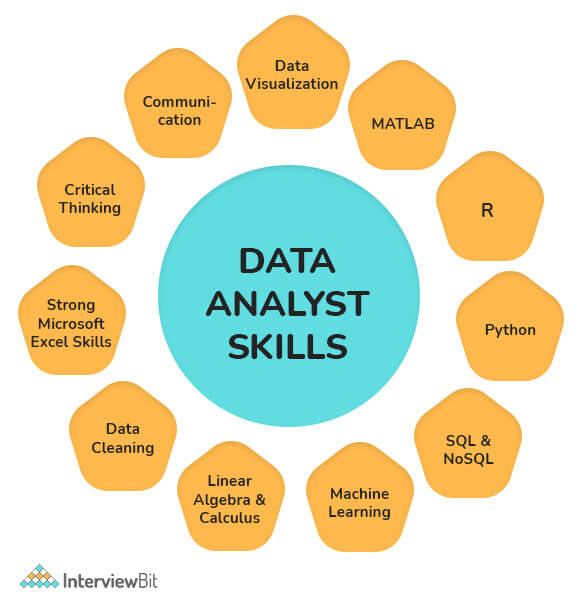
- Knowledge of reporting packages (Business Objects), coding languages (e.g., XML, JavaScript, ETL), and databases (SQL, SQLite, etc.) is a must.
- Ability to analyze, organize, collect, and disseminate big data accurately and efficiently.
- The ability to design databases, construct data models, perform data mining, and segment data.
- Good understanding of statistical packages for analyzing large datasets (SAS, SPSS, Microsoft Excel, etc.).
- Effective Problem-Solving, Teamwork, and Written and Verbal Communication Skills.
- Excellent at writing queries, reports, and presentations.
- Understanding of data visualization software including Tableau and Qlik.
- The ability to create and apply the most accurate algorithms to datasets for finding solutions.
5. What are the different challenges one faces during data analysis?
While analyzing data, a Data Analyst can encounter the following issues:
- Duplicate entries and spelling errors. Data quality can be hampered and reduced by these errors.
- The representation of data obtained from multiple sources may differ. It may cause a delay in the analysis process if the collected data are combined after being cleaned and organized.
- Another major challenge in data analysis is incomplete data. This would invariably lead to errors or faulty results.
- You would have to spend a lot of time cleaning the data if you are extracting data from a poor source.
- Business stakeholders' unrealistic timelines and expectations
- Data blending/ integration from multiple sources is a challenge, particularly if there are no consistent parameters and conventions
- Insufficient data architecture and tools to achieve the analytics goals on time.
 Learn via our Video Courses
6. Explain data cleansing.
Data cleaning, also known as data cleansing or data scrubbing or wrangling, is basically a process of identifying and then modifying, replacing, or deleting the incorrect, incomplete, inaccurate, irrelevant, or missing portions of the data as the need arises. This fundamental element of data science ensures data is correct, consistent, and usable.

7. What are the tools useful for data analysis?
Some of the tools useful for data analysis include:
- RapidMiner
- KNIME
- Google Search Operators
- Google Fusion Tables
- Solver
- NodeXL
- OpenRefine
- Wolfram Alpha
- io
- Tableau, etc.

 Real-Life Problems
 Detailed reports
8. Write the difference between data mining and data profiling.
Data mining Process: It generally involves analyzing data to find relations that were not previously discovered. In this case, the emphasis is on finding unusual records, detecting dependencies, and analyzing clusters. It also involves analyzing large datasets to determine trends and patterns in them.
Data Profiling Process: It generally involves analyzing that data's individual attributes. In this case, the emphasis is on providing useful information on data attributes such as data type, frequency, etc. Additionally, it also facilitates the discovery and evaluation of enterprise metadata.
| Data Mining | Data Profiling |
|---|---|
| It involves analyzing a pre-built database to identify patterns. | It involves analyses of raw data from existing datasets. |
| It also analyzes existing databases and large datasets to convert raw data into useful information. | In this, statistical or informative summaries of the data are collected. |
| It usually involves finding hidden patterns and seeking out new, useful, and non-trivial data to generate useful information. | It usually involves the evaluation of data sets to ensure consistency, uniqueness, and logic. |
| Data mining is incapable of identifying inaccurate or incorrect data values. | In data profiling, erroneous data is identified during the initial stage of analysis. |
| Classification, regression, clustering, summarization, estimation, and description are some primary data mining tasks that are needed to be performed. | This process involves using discoveries and analytical methods to gather statistics or summaries about the data. |
9. Which validation methods are employed by data analysts?
In the process of data validation, it is important to determine the accuracy of the information as well as the quality of the source. Datasets can be validated in many ways. Methods of data validation commonly used by Data Analysts include:
- Field Level Validation: This method validates data as and when it is entered into the field. The errors can be corrected as you go.
- Form Level Validation: This type of validation is performed after the user submits the form. A data entry form is checked at once, every field is validated, and highlights the errors (if present) so that the user can fix them.
- Data Saving Validation: This technique validates data when a file or database record is saved. The process is commonly employed when several data entry forms must be validated.
- Search Criteria Validation: It effectively validates the user's search criteria in order to provide the user with accurate and related results. Its main purpose is to ensure that the search results returned by a user's query are highly relevant.
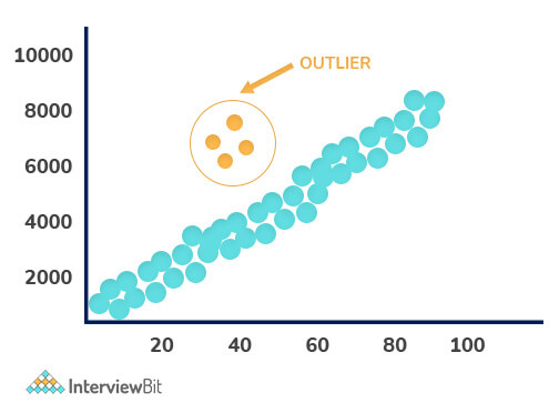
10. Explain Outlier.
In a dataset, Outliers are values that differ significantly from the mean of characteristic features of a dataset. With the help of an outlier, we can determine either variability in the measurement or an experimental error. There are two kinds of outliers i.e., Univariate and Multivariate. The graph depicted below shows there are four outliers in the dataset.
11. What are the responsibilities of a Data Analyst?
Some of the responsibilities of a data analyst include:
- Collects and analyzes data using statistical techniques and reports the results accordingly.
- Interpret and analyze trends or patterns in complex data sets.
- Establishing business needs together with business teams or management teams.
- Find opportunities for improvement in existing processes or areas.
- Data set commissioning and decommissioning.
- Follow guidelines when processing confidential data or information.
- Examine the changes and updates that have been made to the source production systems.
- Provide end-users with training on new reports and dashboards.
- Assist in the data storage structure, data mining, and data cleansing.
12. Write difference between data analysis and data mining.
Data Analysis: It generally involves extracting, cleansing, transforming, modeling, and visualizing data in order to obtain useful and important information that may contribute towards determining conclusions and deciding what to do next. Analyzing data has been in use since the 1960s.
Data Mining: In data mining, also known as knowledge discovery in the database, huge quantities of knowledge are explored and analyzed to find patterns and rules. Since the 1990s, it has been a buzzword.

| Data Analysis | Data Mining |
|---|---|
| Analyzing data provides insight or tests hypotheses. | A hidden pattern is identified and discovered in large datasets. |
| It consists of collecting, preparing, and modeling data in order to extract meaning or insights. | This is considered as one of the activities in Data Analysis. |
| Data-driven decisions can be taken using this way. | Data usability is the main objective. |
| Data visualization is certainly required. | Visualization is generally not necessary. |
| It is an interdisciplinary field that requires knowledge of computer science, statistics, mathematics, and machine learning. | Databases, machine learning, and statistics are usually combined in this field. |
| Here the dataset can be large, medium, or small, and it can be structured, semi-structured, and unstructured. | In this case, datasets are typically large and structured. |
13. Explain the KNN imputation method.
A KNN (K-nearest neighbor) model is usually considered one of the most common techniques for imputation. It allows a point in multidimensional space to be matched with its closest k neighbors. By using the distance function, two attribute values are compared. Using this approach, the closest attribute values to the missing values are used to impute these missing values.
14. Explain Normal Distribution.
Known as the bell curve or the Gauss distribution, the Normal Distribution plays a key role in statistics and is the basis of Machine Learning. It generally defines and measures how the values of a variable differ in their means and standard deviations, that is, how their values are distributed.

The above image illustrates how data usually tend to be distributed around a central value with no bias on either side. In addition, the random variables are distributed according to symmetrical bell-shaped curves.
15. What do you mean by data visualization?
The term data visualization refers to a graphical representation of information and data. Data visualization tools enable users to easily see and understand trends, outliers, and patterns in data through the use of visual elements like charts, graphs, and maps. Data can be viewed and analyzed in a smarter way, and it can be converted into diagrams and charts with the use of this technology.
16. How does data visualization help you?
Data visualization has grown rapidly in popularity due to its ease of viewing and understanding complex data in the form of charts and graphs. In addition to providing data in a format that is easier to understand, it highlights trends and outliers. The best visualizations illuminate meaningful information while removing noise from data.
17. Mention some of the python libraries used in data analysis.
Several Python libraries that can be used on data analysis include:
- NumPy
- Bokeh
- Matplotlib
- Pandas
- SciPy
- SciKit, etc.
18. Explain a hash table.
Hash tables are usually defined as data structures that store data in an associative manner. In this, data is generally stored in array format, which allows each data value to have a unique index value. Using the hash technique, a hash table generates an index into an array of slots from which we can retrieve the desired value.
19. In what ways is data analysis related to business intelligence?
Data analysis and business intelligence (BI) are closely connected fields. Both involve collecting and analyzing data to support decision-making. However, data analysis focuses on exploring and interpreting data to find insights, while business intelligence emphasizes the use of tools and systems to deliver data-driven reports and dashboards for ongoing business monitoring.
20. What does data wrangling involve?
Data wrangling is the process of cleaning, structuring, and enriching raw data to prepare it for analysis. This includes handling missing or inconsistent data, correcting errors, transforming data formats, and combining datasets to create a reliable and usable dataset for further exploration and modeling.Data wrangling is essential for transforming raw data into a usable format, which involves cleaning, structuring, and enriching the data.
21. How do descriptive and predictive analysis differ?
Descriptive analysis summarizes historical data to understand what has happened, using techniques like summary statistics and data visualization. Predictive analysis uses statistical models and machine learning to forecast future events or trends based on historical data, helping organizations anticipate outcomes and make proactive decisions.
22. What are univariate, bivariate, and multivariate analyses?
Univariate analysis examines a single variable to understand its distribution and characteristics. Bivariate analysis explores the relationship between two variables, often using correlation or regression techniques. Multivariate analysis involves three or more variables simultaneously to study complex interactions and patterns within the data.
23. What is feature engineering in data analysis?
Feature engineering is the process of selecting, creating, and transforming variables (features) from raw data to improve the performance of statistical models or machine learning algorithms. It includes techniques like encoding categorical variables, creating interaction terms, and scaling numerical data to enhance model accuracy.
24. What is data normalization, and why is it necessary?
Data normalization is the technique of scaling numerical data to a common range or distribution, often between 0 and 1 or to have a mean of zero and standard deviation of one. Normalization is important to ensure that features contribute equally to analysis or modeling, especially when variables have different units or scales.
25. Which Python libraries are essential for data analysis?
Key Python libraries for data analysis include Pandas for data manipulation, NumPy for numerical computations, Matplotlib and Seaborn for data visualization, and SciPy and Scikit-learn for statistical analysis and machine learning. These libraries provide powerful tools to clean, analyze, visualize, and model data efficiently.
26. How is the Pandas library used in data analysis?
Pandas provides data structures like DataFrames and Series that facilitate easy manipulation, cleaning, and analysis of structured data. It supports operations such as filtering, grouping, aggregating, and merging datasets, making it essential for handling tabular data in Python.
27. What distinguishes a Pandas Series from a DataFrame?
A Pandas Series is a one-dimensional labeled array capable of holding any data type, while a DataFrame is a two-dimensional labeled data structure with columns that can hold different types of data. Essentially, a DataFrame is a collection of Series sharing the same index.
28. What is One-Hot Encoding, and why is it used?
One-Hot Encoding is a technique to convert categorical variables into a binary matrix representation where each category is represented by a separate column with 1s and 0s indicating presence or absence. It enables machine learning algorithms to process categorical data effectively.
29. What is a boxplot, and how does it assist in data analysis?
A boxplot is a graphical representation of data distribution based on five-number summary: minimum, first quartile, median, third quartile, and maximum. It helps identify central tendency, variability, and outliers in the data, making it a valuable tool in exploratory data analysis.
30. How do the roles of data analysts and data scientists differ?
While both data analysts and data scientists work with data, their roles differ in scope and focus. Data analysts primarily gather, clean, and analyze data to identify trends and produce reports that aid business decisions. Data scientists, on the other hand, develop advanced statistical models and machine learning algorithms to predict future outcomes and automate processes, often requiring deeper programming and statistical expertise.
31. What steps are involved in analyzing a dataset?
Analyzing a dataset typically involves the following steps: defining the problem, collecting relevant data, cleaning and preprocessing the data to handle missing or inconsistent values, performing exploratory data analysis (EDA) to identify patterns and trends, applying statistical or machine learning models, and finally, communicating the findings through reports or visualizations.
32. What is hypothesis testing? Explain with a data analyst example.
Hypothesis testing is a statistical method used to determine whether there is enough evidence in a sample to support a claim about a population.
The process usually follows these steps:
1. Define the hypotheses.
- Null hypothesis (H₀): no effect or no difference.
- Alternative hypothesis (H₁): there is an effect or difference.
2. Choose a significance level (α), commonly 0.05.
3. Select an appropriate statistical test (t-test, z-test, chi-square, etc.) depending on the data type and sample size.
4. Calculate the p-value and compare it to α.
- If p < α, reject H₀.
- If p ≥ α, fail to reject H₀.
For example, imagine I’m analyzing an A/B test for an e-commerce checkout page.
- H₀: The new checkout design does not affect conversion rate.
- H₁: The new checkout design increases conversion rate.
After running the experiment, I calculate the p-value. If the p-value is less than 0.05, I reject the null hypothesis and conclude that the new design has a statistically significant impact on conversions.
There are two types of errors to be aware of:
- Type I error: Rejecting a true null hypothesis - false positive.
- Type II error: Failing to reject a false null hypothesis - false negative.
It’s also important to understand that the p-value is not the probability that the hypothesis is true. It measures how likely the observed data would be if the null hypothesis were true.
Finally, statistical significance does not always mean practical significance. A 0.01% improvement in conversion rate may be statistically significant with a large sample size, but it might not meaningfully impact business revenue.
33. What is the difference between correlation and causation? Why does this matter for data analysts?
Correlation measures the strength and direction of a relationship between two variables. If two variables move together, they are correlated.
Causation means one variable directly causes a change in another.
The key principle is: correlation does not imply causation.
For example, ice cream sales and drowning incidents both increase during summer. They are correlated, but ice cream does not cause drowning. The underlying factor is temperature or season. This hidden factor is called a confounding or lurking variable.
This distinction matters because data analysts often identify patterns in historical data. If I present a correlation as a causal relationship without evidence, stakeholders may make incorrect decisions.
To establish causation, I need stronger evidence, such as:
- Controlled experiments (like A/B testing)
- Clear temporal order (cause happens before effect)
- Elimination of confounding variables
There are also spurious correlations, where two variables appear related purely by coincidence.
Another important concept is Simpson’s Paradox. This occurs when a trend observed in aggregated data reverses when the data is segmented. Without careful analysis, I might draw the wrong conclusion from high-level numbers.
34. What are the different types of data sampling techniques?
Sampling means selecting a subset of data from a larger population to analyze and draw conclusions.
The main types of sampling techniques are:
1. Simple Random Sampling: Every element in the population has an equal chance of being selected. This can be done using a random number generator or lottery method. This works well when the population is relatively homogeneous and easy to access.
2. Stratified Sampling: The population is divided into homogeneous subgroups called strata based on a characteristic like age, region, or income level. Then, random samples are taken from each stratum. This ensures that important subgroups are properly represented, especially minority groups.
3. Systematic Sampling: You select every k-th element from an ordered list. For example, every 10th customer in a database. This is simple to implement but can introduce bias if the list has hidden patterns.
4. Cluster Sampling: The population is divided into clusters, such as cities or schools. Then a few clusters are randomly selected, and all or some members within those clusters are studied. This is useful when the population is geographically dispersed and collecting data from all locations is expensive.
5. Convenience Sampling: Data is collected from easily accessible sources. For example, surveying people who walk into a store. This method is quick but prone to bias because the sample may not represent the entire population.
One key concern in sampling is sampling bias. Bias occurs when certain groups are overrepresented or underrepresented in the sample. To avoid it, analysts should:
- Clearly define the population.
- Use probability-based sampling methods when possible.
- Ensure minority segments are not excluded.
- Check whether the sampling method introduces hidden patterns.
Choosing the right sampling technique depends on the research goal, population structure, and available resources.
35. What is the ETL process and why is it important for data analysis?
ETL stands for Extract, Transform, Load. It is the process of moving data from source systems into a format suitable for analysis.
Extract means collecting data from various sources such as databases, APIs, spreadsheets, cloud platforms, or flat files.
Transform involves cleaning and preparing the data. This can include:
- Removing duplicates
- Handling missing values
- Standardizing formats
- Converting data types
- Applying business rules
- Aggregating data
Load means storing the transformed data into a target system such as a data warehouse, data lake, or BI tool.
ETL is important because data quality directly affects analysis quality. If the extraction or transformation is incorrect, the final insights will be misleading. Many reporting mismatches happen due to transformation logic rather than analytical errors.
Understanding ETL helps analysts troubleshoot discrepancies between dashboards and source systems. Even if a data engineer manages the pipeline, an analyst should understand how the data was cleaned and structured.
In many organizations, analysts also build lightweight ETL processes themselves using SQL views, Power Query, or Python scripts.
A modern variation is ELT (Extract, Load, Transform). In ELT, raw data is first loaded into a cloud data warehouse such as Snowflake or BigQuery, and transformations happen inside the warehouse. This approach leverages scalable cloud compute power.
36. What is the difference between OLAP and OLTP systems?
OLTP (Online Transaction Processing) systems are designed to handle day-to-day business transactions. These systems support operations like insert, update, and delete in real time. They are optimized for fast writes and high concurrency.
Examples include banking systems processing transactions, e-commerce platforms recording orders, or CRM systems storing customer updates.
OLTP databases typically use highly normalized schemas, often in third normal form (3NF). This reduces redundancy and maintains data integrity. However, normalized structures are not optimized for large analytical queries.
OLAP (Online Analytical Processing) systems are designed for analysis and reporting. They handle complex queries involving aggregations, comparisons, trends, and historical data analysis.
Examples include data warehouses, BI dashboards, and reporting systems used by analysts and management teams.
OLAP systems are optimized for fast reads rather than writes. They usually use denormalized schemas such as star or snowflake schemas. Fact tables store measurable data, and dimension tables store descriptive attributes. This structure makes aggregation queries efficient.
From a data analyst’s perspective, most analysis should run on OLAP systems, not OLTP systems. Running heavy aggregation queries on an OLTP production database can slow down business applications.
That’s why data warehouses are used. They separate analytical workloads from transactional workloads. Data is extracted from OLTP systems, transformed through ETL processes, and loaded into OLAP systems for reporting and analysis.
In short:
- OLTP handles operational transactions.
- OLAP supports analytical queries.
- OLTP is optimized for fast writes and many concurrent users.
- OLAP is optimized for fast reads over large historical datasets.
Data Analyst Interview Questions for Experienced
1. Write characteristics of a good data model.
An effective data model must possess the following characteristics in order to be considered good and developed:
- Provides predictability performance, so the outcomes can be estimated as precisely as possible or almost as accurately as possible.
- As business demands change, it should be adaptable and responsive to accommodate those changes as needed.
- The model should scale proportionally to the change in data.
- Clients/customers should be able to reap tangible and profitable benefits from it.
2. Write disadvantages of Data analysis.
The following are some disadvantages of data analysis:
- Data Analytics may put customer privacy at risk and result in compromising transactions, purchases, and subscriptions.
- Tools can be complex and require previous training.
- Choosing the right analytics tool every time requires a lot of skills and expertise.
- It is possible to misuse the information obtained with data analytics by targeting people with certain political beliefs or ethnicities.
3. Explain Collaborative Filtering.
Based on user behavioral data, collaborative filtering (CF) creates a recommendation system. By analyzing data from other users and their interactions with the system, it filters out information. This method assumes that people who agree in their evaluation of particular items will likely agree again in the future. Collaborative filtering has three major components: users- items- interests.
Example:
Collaborative filtering can be seen, for instance, on online shopping sites when you see phrases such as "recommended for you”.
4. What do you mean by Time Series Analysis? Where is it used?
In the field of Time Series Analysis (TSA), a sequence of data points is analyzed over an interval of time. Instead of just recording the data points intermittently or randomly, analysts record data points at regular intervals over a period of time in the TSA. It can be done in two different ways: in the frequency and time domains. As TSA has a broad scope of application, it can be used in a variety of fields. TSA plays a vital role in the following places:
- Statistics
- Signal processing
- Econometrics
- Weather forecasting
- Earthquake prediction
- Astronomy
- Applied science
5. What do you mean by clustering algorithms? Write different properties of clustering algorithms?
Clustering is the process of categorizing data into groups and clusters. In a dataset, it identifies similar data groups. It is the technique of grouping a set of objects so that the objects within the same cluster are similar to one another rather than to those located in other clusters. When implemented, the clustering algorithm possesses the following properties:
- Flat or hierarchical
- Hard or Soft
- Iterative
- Disjunctive
6. What is a Pivot table? Write its usage.
One of the basic tools for data analysis is the Pivot Table. With this feature, you can quickly summarize large datasets in Microsoft Excel. Using it, we can turn columns into rows and rows into columns. Furthermore, it permits grouping by any field (column) and applying advanced calculations to them. It is an extremely easy-to-use program since you just drag and drop rows/columns headers to build a report. Pivot tables consist of four different sections:
- Value Area: This is where values are reported.
- Row Area: The row areas are the headings to the left of the values.
- Column Area: The headings above the values area make up the column area.
- Filter Area: Using this filter you may drill down in the data set.

7. What do you mean by univariate, bivariate, and multivariate analysis?
-
Univariate Analysis: The word uni means only one and variate means variable, so a univariate analysis has only one dependable variable. Among the three analyses, this is the simplest as the variables involved are only one.
Example: A simple example of univariate data could be height as shown below:

-
Bivariate Analysis: The word Bi means two and variate mean variables, so a bivariate analysis has two variables. It examines the causes of the two variables and the relationship between them. It is possible that these variables are dependent on or independent of each other.
Example: A simple example of bivariate data could be temperature and ice cream sales in the summer season.

- Multivariate Analysis: In situations where more than two variables are to be analyzed simultaneously, multivariate analysis is necessary. It is similar to bivariate analysis, except that there are more variables involved.
8. Name some popular tools used in big data.
In order to handle Big Data, multiple tools are used. There are a few popular ones as follows:
- Hadoop
- Spark
- Scala
- Hive
- Flume
- Mahout, etc.
9. Explain Hierarchical clustering.
This algorithm group objects into clusters based on similarities, and it is also called hierarchical cluster analysis. When hierarchical clustering is performed, we obtain a set of clusters that differ from each other.

This clustering technique can be divided into two types:
- Agglomerative Clustering (which uses bottom-up strategy to decompose clusters)
- Divisive Clustering (which uses a top-down strategy to decompose clusters)
10. What do you mean by logistic regression?
Logistic Regression is basically a mathematical model that can be used to study datasets with one or more independent variables that determine a particular outcome. By studying the relationship between multiple independent variables, the model predicts a dependent data variable.
11. What do you mean by the K-means algorithm?
One of the most famous partitioning methods is K-mean. With this unsupervised learning algorithm, the unlabeled data is grouped in clusters. Here, 'k' indicates the number of clusters. It tries to keep each cluster separated from the other. Since it is an unsupervised model, there will be no labels for the clusters to work with.

12. Write the difference between variance and covariance.
Variance: In statistics, variance is defined as the deviation of a data set from its mean value or average value. When the variances are greater, the numbers in the data set are farther from the mean. When the variances are smaller, the numbers are nearer the mean. Variance is calculated as follows:

Here, X represents an individual data point, U represents the average of multiple data points, and N represents the total number of data points.
Covariance: Covariance is another common concept in statistics, like variance. In statistics, covariance is a measure of how two random variables change when compared with each other. Covariance is calculated as follows:

Here, X represents the independent variable, Y represents the dependent variable, x-bar represents the mean of the X, y-bar represents the mean of the Y, and N represents the total number of data points in the sample.
13. What are the advantages of using version control?
Also known as source control, version control is the mechanism for configuring software. Records, files, datasets, or documents can be managed with this. Version control has the following advantages:

- Analysis of the deletions, editing, and creation of datasets since the original copy can be done with version control.
- Software development becomes clearer with this method.
- It helps distinguish different versions of the document from one another. Thus, the latest version can be easily identified.
- There's a complete history of project files maintained by it which comes in handy if ever there's a failure of the central server.
- Securely storing and maintaining multiple versions and variants of code files is easy with this tool.
- Using it, you can view the changes made to different files.
14. Explain N-gram
N-gram, known as the probabilistic language model, is defined as a connected sequence of n items in a given text or speech. It is basically composed of adjacent words or letters of length n that were present in the source text. In simple words, it is a way to predict the next item in a sequence, as in (n-1).
15. Mention some of the statistical techniques that are used by Data analysts.
Performing data analysis requires the use of many different statistical techniques. Some important ones are as follows:
- Markov process
- Cluster analysis
- Imputation techniques
- Bayesian methodologies
- Rank statistics
16. What's the difference between a data lake and a data warehouse?
The storage of data is a big deal. Companies that use big data have been in the news a lot lately, as they try to maximize its potential. Data storage is usually handled by traditional databases for the layperson. For storing, managing, and analyzing big data, companies use data warehouses and data lakes.
Data Warehouse: This is considered an ideal place to store all the data you gather from many sources. A data warehouse is a centralized repository of data where data from operational systems and other sources are stored. It is a standard tool for integrating data across the team- or department-silos in mid-and large-sized companies. It collects and manages data from varied sources to provide meaningful business insights. Data warehouses can be of the following types:
- Enterprise data warehouse (EDW): Provides decision support for the entire organization.
- Operational Data Store (ODS): Has functionality such as reporting sales data or employee data.
Data Lake: Data lakes are basically large storage device that stores raw data in their original format until they are needed. with its large amount of data, analytical performance and native integration are improved. It exploits data warehouses' biggest weakness: their incapacity to be flexible. In this, neither planning nor knowledge of data analysis is required; the analysis is assumed to happen later, on-demand.
Conclusion:
The purpose of Data Analysis is to transform data to discover valuable information that can be used for making decisions. The use of data analytics is crucial in many industries for various purposes, hence, the demand for Data Analysts is therefore high around the world. Therefore, we have listed the top data analyst interview questions & answers you should know to succeed in your interview. From data cleaning to data validation to SAS, these questions cover all the essential information related to the data analyst role.
Important Resources:
17. How do structured and unstructured data differ?
Structured data is organized into predefined formats such as tables or spreadsheets, making it easy to search and analyze. Unstructured data lacks a specific format and includes text, images, videos, and social media content, requiring specialized techniques like natural language processing to extract meaningful information.
18. How do you communicate technical findings to non-technical stakeholders?
When I communicate my findings, I think about what decision the stakeholder needs to make.
I don’t walk them through the full analytical process unless it’s necessary. I explain what we were trying to understand, what the data shows, and what that means for the business.
For example, if I analyzed declining revenue, I would explain which segment is underperforming, how much revenue is being affected, and what behavioral pattern is driving it. I focus on the magnitude of impact and the business implications rather than the statistical mechanics behind it.
If I used a model, I would summarize it at a high level, for example, that we analyzed six months of behavioral data and identified the strongest predictors. I avoid technical jargon unless someone specifically asks for details.
I also make sure I’m clear about limitations. If the result is based on historical patterns and not a controlled experiment, I state that. If there are assumptions that affect interpretation, I mention them briefly so expectations are realistic.
Finally, I always close with a recommendation. If the analysis shows a pricing issue, I suggest a pricing test. If it highlights onboarding gaps, I suggest a targeted intervention. Data without a next step doesn’t help stakeholders move forward.
19. How would you design and evaluate an A/B test?
I start by being very clear about what we’re trying to improve. An A/B test without a clearly defined hypothesis usually leads to noisy results.
First, I define the hypothesis. For example, if we’re testing a new checkout design:
- H₀: There is no difference in conversion rate between the old and new design.
- H₁: The new design increases conversion rate.
Then I define the primary metric. I choose one main success metric, conversion rate, revenue per user, or click-through rate, depending on the goal. If I don’t define this upfront, it’s easy to cherry-pick results later.
Next, I calculate the required sample size. I use power analysis with a significance level (usually 0.05), desired power (commonly 80%), and a minimum detectable effect. This tells me how many users I need in each group before the test starts. Running a test without proper sample size planning often leads to inconclusive or misleading results.
I randomize users into control (A) and treatment (B) groups to ensure both groups are statistically comparable. Randomization is critical here, since without it, bias can occur.
I also decide in advance how long the test will run. I avoid checking results daily and stopping the test early just because it looks significant. Peeking at results increases the chance of false positives due to repeated testing.
When evaluating results, I first check for sample ratio mismatch. If the control and treatment groups are not distributed as expected, there may be an implementation issue.
Then I calculate the test statistic and p-value. If p < 0.05, I conclude the result is statistically significant, but I don’t stop there.
I check the practical significance. A 0.2% lift might be statistically significant with a large sample, but it may not justify engineering effort or rollout risk.
I also review guardrail metrics, metrics that should not degrade, such as page load time or refund rate. Improving one metric while harming another can create unintended consequences.
Finally, I look for novelty effects or seasonality. Sometimes a new feature performs well initially simply because it’s new. I check whether the effect sustains over time.
If the experiment is more complex, I may run multi-variant testing, but that requires larger sample sizes and careful correction for multiple comparisons.
20. What are KPIs? How do you decide which KPIs to track for a business?
KPIs, or Key Performance Indicators, are measurable metrics that show whether a business is moving toward its goals.
The important part isn’t the metric itself, it’s the alignment with business objectives.
When deciding which KPIs to track, I start with the company’s primary goal. If the focus is revenue growth, I look at metrics like conversion rate, average order value, or monthly recurring revenue. If the focus is retention, I look at churn rate, repeat purchase rate, or customer lifetime value.
I make sure each KPI is clearly defined. Two teams can track “revenue” but calculate it differently. So I document the formula, data source, and refresh frequency. If the definition isn’t standardized, reporting will eventually break down.
I also separate leading and lagging indicators. Revenue is a lagging metric; it tells you what already happened. Website traffic or trial signups can be leading indicators; they signal what might happen next. A good dashboard includes both.
I limit the number of KPIs per dashboard. If there are 20 metrics on the screen, none of them are truly “key.” I usually aim for five to seven that directly reflect performance.
Another thing I watch for is vanity metrics. Page views or app downloads may look impressive, but if they don’t tie to revenue, retention, or profitability, they don’t help decision-making. I prioritize metrics that drive action.
Ultimately, a KPI should answer one question clearly: Are we moving in the right direction on our core objective?
21. How do you handle conflicting data from multiple sources?
When numbers don’t match across systems, I approach it methodically.
First, I define the discrepancy precisely. Which metric differs? By how much? Over what time period? Vague comparisons make debugging harder.
Then I check data freshness. One source might be updated daily while another refreshes hourly. A timing mismatch alone can explain differences.
Next, I compare definitions. The same term can mean different things in different systems. “Revenue” might include refunds in one report but exclude them in another. “Active user” might mean logged in versus completed a transaction. Misaligned definitions are one of the most common causes of mismatch.
I also check granularity. One system might count transactions at the order level, while another counts line items. One order with three products could appear as one record in one system and three in another.
After that, I review transformations. I look at ETL logic, currency conversions, filters, deduplication steps, and time zone handling. Small transformation differences can compound into large reporting gaps.
If the issue isn’t obvious, I trace both systems back to raw data. I extract a small subset, for example, one day of data, and compare row by row. That usually reveals where the divergence begins.
Once I identify the root cause, I document it and align stakeholders on a single authoritative source for that metric. Establishing a “single source of truth” prevents the same conflict from recurring.
Data Visualization and Power BI Interview Questions
1. How do dimensions differ from measures in Tableau?
Dimensions are descriptive fields used to categorize or segment data, such as "Country" or "Product Category." Measures are numeric fields that can be aggregated, like "Sales" or "Profit." For example, you might use "Region" (dimension) to group your sales numbers (measure) by geographic area.
2. Can you describe the components of Tableau such as dashboards, worksheets, stories, and workbooks?
A worksheet is a single view or chart, such as a bar chart showing monthly sales. Dashboards combine multiple worksheets into one page to provide a comprehensive view—for example, a sales dashboard showing charts for sales, profit, and customer demographics. Stories are sequences of dashboards or worksheets arranged to tell a data-driven narrative, like guiding a user through quarterly performance. A workbook is the entire Tableau file containing all worksheets, dashboards, and stories.
3. What are the various Tableau products and their uses?
Tableau Desktop is used for creating visualizations and reports. Tableau Server and Tableau Online allow sharing and collaboration of dashboards within organizations or online. Tableau Prep helps with data cleaning and preparation tasks. Tableau Public is a free platform for publishing public visualizations accessible to everyone.
4. What distinguishes joining from blending data in Tableau?
Joining merges tables from the same data source based on common fields, creating a combined dataset before analysis—for example, joining "Sales" and "Customer" tables on "Customer ID." Blending combines data from different sources at the visualization level, linking related fields dynamically, such as blending sales data from Excel with web analytics from Google Analytics.
5. What is the difference between discrete and continuous fields in Tableau?
Discrete fields have distinct, separate values, like "Product Category," and create headers or labels in views. Continuous fields represent data on a continuous scale, like "Sales Amount," and create axes for charts. For example, a bar chart might use discrete categories on the x-axis and continuous sales values on the y-axis.
6. Could you explain live connections versus extracts in Tableau?
Live connections query the data source in real-time, ensuring up-to-date data but potentially slower performance. Extracts are snapshots of data saved locally in Tableau’s optimized format, which load faster but require periodic refreshing. For example, a live connection to a database reflects the latest sales data, while an extract might be refreshed daily for faster dashboard loading.
7. What types of joins does Tableau support?
Tableau supports Inner Join (returns matching records from both tables), Left Join (all records from left table plus matching from right), Right Join (all from right plus matching from left), and Full Outer Join (all records from both tables, matched where possible). For example, a Left Join can show all customers and their orders, including customers with no orders.
8. How do you create and use calculated fields in Tableau?
Calculated fields are custom fields defined by formulas using existing data. For instance, you can create a calculated field called "Profit Margin" as [Profit] divided by [Sales]. This allows you to analyze profitability beyond raw data.
9. What data aggregation functions are available in Tableau?
Tableau offers functions like SUM (total sales), AVG (average profit), COUNT (number of orders), MIN (lowest price), MAX (highest revenue), and MEDIAN (middle value). For example, you might sum sales to see total revenue per region.
10. What data aggregation functions are available in Tableau?
Calculated fields are custom fields defined by formulas using existing data. For instance, you can create a calculated field called "Profit Margin" as [Profit] divided by [Sales]. This allows you to analyze profitability beyond raw data.
11. How do .twbx and .twb Tableau files differ?
A .twb file is a lightweight XML file storing workbook structure and instructions, but it does not include data. A .twbx file is a packaged workbook that bundles the .twb file with data sources and images, making it portable and easy to share without needing access to the original data source.
12. What are the different data types supported by Tableau?
Tableau supports String (text), Number (integer and decimal), Date, Date & Time, Boolean (true/false), and Geographic data types like country or postal codes. For example, "Order Date" is a Date type, while "Customer Name" is a String.
SQL Interview Questions for Data Analysts
1. What is a Database Management System (DBMS)?
A Database Management System (DBMS) is software that enables users to define, create, maintain, and control access to databases. It acts as an interface between end-users and the database, ensuring data is organized and accessible efficiently.
2. Can you explain the basic CRUD operations in SQL?
CRUD stands for Create, Read, Update, and Delete, which are the four fundamental operations performed on data in a database. These operations allow you to insert new records, retrieve existing data, modify records, and remove data from tables.
Example :
sql -- Create: Insert a new record into the Employees table INSERT INTO Employees (EmployeeID, FirstName, LastName, Department) VALUES (101, 'John', 'Doe', 'Sales');
-- Read: Select records from the Employees table SELECT * FROM Employees WHERE Department = 'Sales';
-- Update: Modify existing records in the Employees table UPDATE Employees SET Department = 'Marketing' WHERE EmployeeID = 101;
-- Delete: Remove records from the Employees table DELETE FROM Employees WHERE EmployeeID = 101;
3. Which SQL statement is used to add new records to a table?
The INSERT INTO statement is used to add new rows to a table. It specifies the table name, columns, and the values to be inserted.
Example:
sql INSERT INTO Products (ProductID, ProductName, Price) VALUES (1, 'Laptop', 1200);4. How do you retrieve specific records from a table using SQL?
You can filter records by using the WHERE clause in a SELECT statement. This clause allows you to specify conditions that records must meet to be included in the result set.
Example:
sql SELECT * FROM Orders WHERE OrderDate >= '2023-01-01' AND CustomerID = 1001;5. What is the method to arrange query results in ascending or descending order?
The ORDER BY clause is used to sort the query results. By default, it sorts in ascending order, but you can specify DESC for descending order.
Example:
sql SELECT ProductName, Price FROM Products ORDER BY Price DESC;6. What role does the GROUP BY clause play in SQL queries?
GROUP BY groups rows that have the same values in specified columns into summary rows, often used with aggregate functions like COUNT or SUM to summarize data.
Example:
sql SELECT Department, COUNT(EmployeeID) AS NumberOfEmployees FROM Employees GROUP BY Department;7. How are aggregate functions like SUM, COUNT, AVG, MAX, and MIN used in SQL?
Aggregate functions perform calculations on sets of rows and return a single value. For example, SUM adds up values, COUNT counts rows, AVG calculates the average, MAX finds the maximum, and MIN finds the minimum value within a group.
Example:
sql SELECT AVG(Salary) AS AverageSalary, MAX(Salary) AS MaxSalary FROM Employees;
8. What is an SQL JOIN, and what different types of joins exist?
An SQL JOIN combines rows from two or more tables based on a related column between them. The main types are INNER JOIN (returns matching rows), LEFT JOIN (all rows from the left table and matched rows from the right), RIGHT JOIN (all rows from the right table and matched rows from the left), and FULL JOIN (all rows when there is a match in either table).
Example:
sql -- INNER JOIN example SELECT Employees.EmployeeID, Employees.FirstName, Departments.DepartmentName FROM Employees INNER JOIN Departments ON Employees.DepartmentID = Departments.DepartmentID;10. What is a subquery in SQL, and how is it used?
A subquery is a query nested inside another SQL query, often used in the WHERE clause to filter results based on the outcome of the subquery.
Example:
sql SELECT EmployeeID, FirstName, LastName FROM Employees WHERE DepartmentID IN ( SELECT DepartmentID FROM Departments WHERE Location = 'New York' )11. How does the HAVING clause differ from the WHERE clause in SQL?
How does the HAVING clause differ from the WHERE clause in SQL?
The HAVING clause filters groups created by the GROUP BY clause based on aggregate conditions, whereas the WHERE clause filters individual rows before grouping occurs.
Example:
sql SELECT Department, COUNT(EmployeeID) AS EmployeeCount FROM Employees GROUP BY Department HAVING COUNT(EmployeeID) > 5;12. What is the difference between the UNION and UNION ALL operators in SQL?
UNION combines results from multiple SELECT statements and removes duplicate rows, while UNION ALL includes all rows, including duplicates, from the combined queries.
Example:
sql -- UNION removes duplicates SELECT City FROM Customers UNION SELECT City FROM Suppliers;
-- UNION ALL includes duplicates SELECT City FROM Customers UNION ALL SELECT City FROM Suppliers;
SQL Interview Questions for a Data Analyst 2026
1. What are window functions in SQL? Explain ROW_NUMBER, RANK, and DENSE_RANK with examples.
Window functions perform calculations across a set of rows related to the current row without collapsing them into a single result. Unlike GROUP BY, which aggregates rows, window functions retain individual rows while adding computed values.
The general syntax looks like:
function_name() OVER (
   PARTITION BY column
   ORDER BY column
)
PARTITION BY divides the data into groups, and ORDER BY defines how rows are arranged within each group.
Suppose we have an employees table with employee_name, department, and salary.
ROW_NUMBER() assigns a unique sequential number within each partition. Even if two employees have the same salary, they still receive different row numbers.
SELECT
   employee_name,
   department,
   salary,
   ROW_NUMBER() OVER (
       PARTITION BY department
       ORDER BY salary DESC
   ) AS row_num
FROM employees;
This is commonly used when you need to select exactly one row per group, such as removing duplicates or getting the top record per category.
RANK() also ranks rows within a partition, but if two values tie, they receive the same rank, and the next rank is skipped. For example, rankings might look like 1, 2, 2, 4.
RANK() OVER (
   PARTITION BY department
   ORDER BY salary DESC
)
This is useful when ranking position matters, such as identifying performance tiers.
DENSE_RANK() behaves similarly to RANK(), but it does not skip numbers after ties. Rankings would look like 1, 2, 2, 3.
DENSE_RANK() OVER (
   PARTITION BY department
   ORDER BY salary DESC
)
This is useful when you want a continuous ranking without gaps.
Another important set of window functions includes LAG() and LEAD(), which allow you to access values from previous or next rows without joining the table to itself. For example, to calculate month-over-month revenue change:
SELECT
   month,
   revenue,
   revenue - LAG(revenue) OVER (ORDER BY month) AS revenue_change
FROM monthly_sales;
LAG() retrieves the previous row’s value, while LEAD() retrieves the next row’s value.
Window functions are widely used for ranking, deduplication, running totals, and time-based comparisons like MoM or YoY growth. They are one of the most important intermediate SQL concepts for data analyst interviews because they allow advanced analytical queries without losing row-level detail.
2. What is a CTE (Common Table Expression) in SQL? How does it differ from a subquery and a temp table?
A CTE, or Common Table Expression, is a named temporary result set defined using the WITH clause. It exists only for the duration of the query execution and improves readability by breaking complex logic into steps.
The basic syntax looks like this:
WITH cte_name AS (
   SELECT ...
)
SELECT *
FROM cte_name;
For example, a common data analyst pattern is to aggregate first and then apply window functions on top:
WITH monthly_sales AS (
   SELECT
       DATE_TRUNC('month', order_date) AS month,
       SUM(amount) AS total
   FROM orders
   GROUP BY 1
)
SELECT
   month,
   total,
   total - LAG(total) OVER (ORDER BY month) AS mom_change
FROM monthly_sales;
Here, I calculate monthly totals inside the CTE and then compute the month-over-month change in the outer query. This makes the logic much clearer than nesting everything inside one large query.
Compared to a subquery, a CTE is more readable and easier to debug. A subquery is written inline, often inside FROM or WHERE, and cannot be referenced multiple times unless repeated. Deeply nested subqueries can quickly become hard to maintain.
A temporary table is different because it is physically stored (usually in tempdb) and persists for the duration of a session. It can be referenced across multiple queries. Temp tables are useful when the intermediate result needs to be reused multiple times or when working with very large datasets that benefit from indexing.
In short:
- CTE: improves readability within a single query.
- Subquery: compact but harder to manage when nested.
- Temp table: persists across statements and is useful for complex multi-step workflows.
3. How do you use CASE WHEN in SQL for data categorization and conditional aggregation?
CASE WHEN provides conditional logic in SQL. It works like an IF-ELSE statement and is widely used for categorization and conditional aggregation.
For example, to categorize customers by age:
SELECT
   customer_id,
   CASE
       WHEN age < 18 THEN 'Minor'
       WHEN age BETWEEN 18 AND 35 THEN '18-35'
       WHEN age BETWEEN 36 AND 55 THEN '36-55'
       ELSE '55+'
   END AS age_group
FROM customers;
This creates a derived column based on conditions.
One of the most powerful uses of CASE is conditional aggregation. For example, if I want to calculate sales by category in separate columns:
SELECT
   customer_id,
   SUM(CASE WHEN category = 'Electronics' THEN amount ELSE 0 END) AS electronics_sales,
   SUM(CASE WHEN category = 'Clothing' THEN amount ELSE 0 END) AS clothing_sales
FROM orders
GROUP BY customer_id;
This acts like a pivot operation without using a pivot function.
CASE is also commonly used for KPI calculations. For example, to calculate a completion rate:
SELECT
   COUNT(CASE WHEN status = 'completed' THEN 1 END) * 100.0 / COUNT(*) AS completion_rate
FROM orders;
Since COUNT ignores NULL values, this pattern counts only rows that meet the condition.
CASE can also be used inside ORDER BY for custom sorting, such as prioritizing specific categories, or inside aggregate functions for funnel analysis, where each stage is counted conditionally.
Hence, CASE WHEN is essential for transforming raw data into business-friendly categories and building metrics directly within SQL queries.
4. How do you handle NULL values in SQL? Explain IS NULL, COALESCE, and NULLIF.
NULL represents missing or unknown data. It does not behave like a regular value.
One important rule is that NULL = NULL does not return TRUE. It returns NULL. That’s why comparisons using = don’t work with NULL. You must use IS NULL or IS NOT NULL.
For example:
SELECT *
FROM users
WHERE email IS NULL;
In arithmetic expressions, if any operand is NULL, the result is usually NULL. For example, salary + bonus returns NULL if either value is NULL.
Aggregates treat NULLs differently. AVG(column) and SUM(column) ignore NULL values. COUNT(column) counts only non-NULL values, while COUNT(*) counts all rows.
COALESCE is used to replace NULL values with the first non-NULL expression in a list.
SELECT COALESCE(phone, email, 'No Contact') AS contact_info
FROM customers;
This returns the phone number if available, otherwise email, and if both are NULL, it returns 'No Contact'.
NULLIF is used to return NULL when two expressions are equal. It’s often used to prevent division by zero.
SELECT revenue / NULLIF(cost, 0) AS profit_ratio
FROM finance;
If cost is 0, NULLIF(cost, 0) returns NULL, which prevents a divide-by-zero error.
Another important behavior is how NULL interacts with filtering. If you write:
WHERE status != 'completed'Rows where status is NULL are excluded because comparisons with NULL return unknown, not TRUE. If you want to include NULLs, you must handle them explicitly.
NULL values also appear in LEFT JOIN results when there is no matching row in the joined table. Understanding this is critical when debugging missing data.
Handling NULL properly is essential in analytics because incorrect assumptions about NULL behavior can silently change results.
5. Write a SQL query to find and remove duplicate records from a table.
To find duplicates, I usually start with GROUP BY and HAVING.
SELECT email, COUNT(*)
FROM customers
GROUP BY email
HAVING COUNT(*) > 1;
This shows which email values appear more than once.
To inspect the actual duplicate rows, I use a window function like ROW_NUMBER().
WITH ranked AS (
   SELECT *,
          ROW_NUMBER() OVER (
              PARTITION BY email
              ORDER BY created_at DESC
          ) AS rn
   FROM customers
)
SELECT *
FROM ranked
WHERE rn > 1;
This assigns a row number within each email group. The most recent record (based on created_at) gets rn = 1. All rows with rn > 1 are duplicates.
To delete duplicates while keeping the latest record:
WITH ranked AS (
   SELECT *,
          ROW_NUMBER() OVER (
              PARTITION BY email
              ORDER BY created_at DESC
          ) AS rn
   FROM customers
)
DELETE FROM customers
WHERE id IN (
   SELECT id
   FROM ranked
   WHERE rn > 1
);
This keeps the most recent record per email and removes the rest.
Another way to identify duplicates is using a self-join:
SELECT a.*
FROM customers a
JOIN customers b
 ON a.email = b.email
AND a.id > b.id;
This returns duplicate rows based on matching emails.
Deduplication is often part of data quality checks or ETL validation. Before deleting duplicates, I usually investigate why they occurred, whether due to upstream ingestion issues or business logic errors, so the problem doesn’t repeat.
6. How do you calculate running totals and moving averages in SQL?
Running totals and moving averages are calculated using window functions with an OVER clause.
A running total calculates a cumulative sum from the beginning up to the current row. For example:
SELECT
   order_date,
   daily_revenue,
   SUM(daily_revenue) OVER (
       ORDER BY order_date
       ROWS BETWEEN UNBOUNDED PRECEDING AND CURRENT ROW
   ) AS running_total
FROM daily_sales;
UNBOUNDED PRECEDING means the calculation starts from the first row in the partition. CURRENT ROW means it includes the current row. So each row shows total revenue accumulated up to that date.
For moving averages, you define a rolling window using a frame clause.
For example, a 7-day moving average:
SELECT
   order_date,
   daily_revenue,
   AVG(daily_revenue) OVER (
       ORDER BY order_date
       ROWS BETWEEN 6 PRECEDING AND CURRENT ROW
   ) AS rolling_7day_avg
FROM daily_sales;
Here, 6 PRECEDING means six rows before the current row. Including the current row gives a 7-day window.
The frame clause is important:
- UNBOUNDED PRECEDING starts from the first row.
- N PRECEDING looks back N rows.
- CURRENT ROW refers to the current row.
- N FOLLOWING looks forward.
Running totals are commonly used to track cumulative revenue or user growth. Moving averages are used to smooth short-term fluctuations and identify broader trends or inflection points.
7. Write a SQL query to calculate month-over-month and year-over-year growth rates.
To calculate month-over-month growth, I first aggregate revenue by month using a CTE, then use LAG() to access the previous month’s value.
WITH monthly AS (
   SELECT
       DATE_TRUNC('month', order_date) AS month,
       SUM(revenue) AS total_revenue
   FROM orders
   GROUP BY 1
)
SELECT
   month,
   total_revenue,
   LAG(total_revenue) OVER (ORDER BY month) AS prev_month,
   ROUND(
       (total_revenue - LAG(total_revenue) OVER (ORDER BY month)) * 100.0
       / NULLIF(LAG(total_revenue) OVER (ORDER BY month), 0),
       2
   ) AS mom_growth_pct
FROM monthly;
LAG(total_revenue) retrieves the previous month’s revenue. NULLIF prevents division by zero if the previous month’s revenue is zero.
For year-over-year growth, I shift by 12 months:
LAG(total_revenue, 12) OVER (ORDER BY month)That retrieves revenue from the same month in the previous year.
This pattern combines aggregation, window functions, and safe division. It’s one of the most frequently asked SQL scenarios in data analyst interviews because it tests both analytical thinking and SQL fluency.
8. What is a SQL query execution plan? How do you optimize slow queries?
A SQL execution plan shows how the database engine executes a query. It describes the sequence of operations, how tables are scanned, how joins are performed, whether indexes are used, and how results are sorted or aggregated.
You can view it using EXPLAIN in PostgreSQL or MySQL. If you want actual runtime statistics, you use EXPLAIN ANALYZE.
When reading an execution plan, I focus on a few things.
If I see a full table scan on a very large table, that’s usually a red flag. It means the database is scanning every row instead of using an index. On large datasets, that slows things down significantly.
I also check join strategies. Nested loop joins can become inefficient when both tables are large. In such cases, a hash join or merge join may perform better, depending on the database engine.
Sort operations can also be expensive, especially if they spill to disk. That often indicates an index could help.
To optimize slow queries, I start with indexing. I add indexes on columns used in WHERE, JOIN, and ORDER BY clauses. However, I avoid over-indexing, since too many indexes can slow down writes.
I also avoid SELECT *. Fetching only the necessary columns reduces I/O and improves performance.
Another common issue is applying functions to indexed columns in the WHERE clause. For example:
WHERE YEAR(order_date) = 2024This prevents the index from being used. Instead, I rewrite it as:
WHERE order_date >= '2024-01-01'
 AND order_date < '2025-01-01'
That allows the index to be used efficiently.
For large subqueries, I often prefer EXISTS over IN, especially when dealing with correlated conditions.
I also check whether DISTINCT is being used unnecessarily. Sometimes it hides duplicate rows caused by incorrect joins rather than solving the underlying issue.
You must remember that this becomes important when dashboard queries start taking minutes to load. Understanding execution plans helps diagnose whether the bottleneck is missing indexes, inefficient joins, or poorly structured filters.
9. How do you write a self-join in SQL? Provide a data analyst use case.
A self-join is when you join a table to itself. You use aliases to treat the same table as two different logical tables.
One common example is an employee-manager hierarchy:
SELECT
   e.name AS employee,
   m.name AS manager
FROM employees e
LEFT JOIN employees m
   ON e.manager_id = m.employee_id;
Here, the employees table is joined to itself to map each employee to their manager.
Another data analyst use case is retention or consecutive activity analysis. For example, to find users who logged in on consecutive days:
SELECT
   a.user_id,
   a.login_date,
   b.login_date AS next_day
FROM logins a
JOIN logins b
   ON a.user_id = b.user_id
  AND b.login_date = a.login_date + INTERVAL '1 day';
This compares rows within the same table to identify behavioral patterns.
Self-joins are also used to compare rows within categories. For example, finding products priced higher than the average in their category may require comparing product rows against category-level aggregates.
Although self-join is not a separate join type, it’s a common pattern in data analyst interviews because it tests your ability to reason about relationships within the same dataset.
Power BI Questions and Answers for Interview
1. What is DAX in Power BI? Explain the difference between CALCULATE and FILTER functions.
DAX (Data Analysis Expressions) is the formula language used in Power BI to create measures, calculated columns, and custom logic inside the data model. It is designed for analytical calculations and works heavily with filter and row context.
CALCULATE is one of the most important functions in DAX. It evaluates an expression after modifying the filter context. The filter arguments are applied before the expression runs.
For example:
CALCULATE([Total Sales], Products[Category] = "Electronics")Here, Power BI first applies the filter on Products[Category] and then evaluates [Total Sales] within that modified context. Column-based filters inside CALCULATE are efficient because they are pushed to the storage engine.
FILTER, on the other hand, returns a table. It evaluates a Boolean condition row by row and keeps only the rows where the condition is true.
For example:
FILTER(Products, Products[Price] > 100)This does not return a number; it returns a filtered table. I typically use FILTER inside CALCULATE when the condition cannot be expressed as a simple column filter.
For example:
CALCULATE(
   [Total Sales],
   FILTER(Products, [Profit Margin] > 0.2)
)
If [Profit Margin] is a measure, DAX must evaluate it row by row, so FILTER becomes necessary.
A key concept here is context transition. When CALCULATE runs inside a row context, it converts that row context into filter context before evaluating the expression. This behavior is fundamental in advanced DAX.
In terms of performance, simple column filters inside CALCULATE are faster than wrapping everything inside FILTER, especially on large tables.
Functions like ALL or REMOVEFILTERS are often used with CALCULATE to clear existing filters before applying new ones.
So the difference is:
- CALCULATE modifies filter context and evaluates an expression.
- FILTER iterates row by row and returns a table.
- Column filters are preferred for performance when possible.
2. What is query folding in Power Query, and why is it critical for report performance?
Query folding is the ability of Power Query to translate transformation steps into native queries that run at the source database instead of inside Power BI.
When folding works, Power BI pushes operations like filtering, grouping, or sorting back to the database. The database processes the query and sends only the final result to Power BI.
When folding breaks, Power BI first downloads the entire dataset and then applies transformations locally. On large tables, this significantly increases refresh time and memory usage.
Common foldable steps include:
- Filtering rows
- Selecting or removing columns
- Sorting
- Grouping
- Joins
- Data type changes
Folding often breaks when you add complex custom columns using M functions, merge with non-relational sources like Excel, or use functions such as Table.Buffer(). Some pivot or unpivot operations can also stop folding depending on the source.
The order of steps matters. I place foldable transformations early in the query and more complex steps later. Once folding breaks at a certain step, all subsequent steps execute inside Power BI.
To verify folding, I right-click a step in Power Query and select “View Native Query.” If the option is available, folding is still happening. If it is grayed out, folding has already broken.
Query folding works primarily with relational sources such as SQL Server or PostgreSQL. It does not apply in the same way to Excel, CSV, or SharePoint files.
Understanding query folding is critical for performance because it determines whether heavy computation happens in a powerful database engine or inside the Power BI engine.
3. Explain Import mode, DirectQuery, and Live Connection in Power BI. When do you use each?
Power BI supports different storage modes, and the choice affects performance, scalability, and flexibility.
In Import mode, data is loaded into Power BI’s in-memory engine (VertiPaq) during refresh. All queries run against this compressed in-memory model. This gives the fastest performance and full DAX functionality.
The trade-off is size limitation. In Power BI Pro, the dataset size limit is 1 GB. In Premium, it can go much higher. Import mode is ideal when the dataset fits comfortably within limits, and report responsiveness is a priority.
In DirectQuery, Power BI does not store the data. Every time a user interacts with a visual, Power BI sends a query to the source database. The data is always current because it is fetched in real time.
However, performance depends entirely on the source system. Complex visuals can generate heavy queries. Some DAX functions are limited in DirectQuery, and transformations in Power Query are restricted after the connection.
I use DirectQuery when the dataset is too large to import or when near real-time data is required.
Live Connection is different. It connects Power BI to an external model, such as SQL Server Analysis Services (SSAS) or a shared Power BI dataset. The data model is maintained outside the report. You cannot modify the model or create additional tables in Power BI Desktop when using a strict live connection.
Live Connection is typically used in enterprise environments where a centralized BI team maintains a certified data model, and multiple report authors build reports on top of it.
There is also a Composite model, which combines Import and DirectQuery in the same dataset. For example, dimension tables can be imported for fast filtering, while a large fact table stays in DirectQuery. This approach balances performance and scale.
Here’s what I do:
- If the dataset is manageable in size and performance matters, I use Import.
- If the data is extremely large or must always be current, I consider DirectQuery or Composite.
- If the organization has a centrally managed semantic model, I use Live Connection.
4. How would you design a star schema data model in Power BI?
A star schema consists of a central fact table surrounded by dimension tables.
The fact table contains measurable business events, for example, Fact_Sales with columns like OrderID, ProductKey, CustomerKey, DateKey, Quantity, and Revenue.
Dimension tables contain descriptive attributes. For example:
- Dim_Product with product name, category, brand
- Dim_Customer with customer name, region, segment
- Dim_Date with date, month, quarter, year
Each dimension table connects to the fact table using a one-to-many relationship. The dimension side has unique keys, and the fact table contains foreign keys.
I always configure relationships as single-directional from dimension to fact. This ensures predictable filter flow. Bi-directional filters can create ambiguity and unexpected results in DAX, especially in complex models.
I avoid snowflaking dimensions, meaning I don’t normalize dimension tables into multiple smaller related tables. Keeping dimensions denormalized improves performance and simplifies reporting.
A dedicated Date dimension is essential. It should contain continuous dates without gaps and include columns like Year, Quarter, Month, Week, etc. I mark it as the official Date Table in Power BI to enable time intelligence functions.
In some cases, I use role-playing dimensions. For example, a sales table may have both Order Date and Ship Date. The same Date table can connect to both, but only one relationship can be active at a time. I handle the second relationship using USERELATIONSHIP in DAX.
Star schema benefits include better compression in the VertiPaq engine, simpler DAX calculations, and consistent filtering behavior.
5. What is Row Level Security (RLS) in Power BI? How do you implement dynamic RLS?
Row Level Security (RLS) restricts data access at the row level based on the user viewing the report. It ensures that users only see the data they are authorized to see.
A simple implementation is static RLS. For example, if regional managers should only see their own region’s data, I can create a role with a DAX filter like:
[Region] = "North"Then I assign users to that role in Power BI Service. This works, but it doesn’t scale. Every new region requires a new role, and managing users becomes tedious.
In most real-world scenarios, I implement dynamic RLS.
First, I create a security mapping table that contains at least two columns: UserEmail and Region. Each row defines which region a specific user can access.
Then I create a single role and apply a DAX filter like:
[Region] IN
CALCULATETABLE(
   VALUES(SecurityTable[Region]),
   SecurityTable[UserEmail] = USERPRINCIPALNAME()
)
USERPRINCIPALNAME() returns the logged-in user’s email. This way, access is determined dynamically. If a new manager joins, I just add a row in the mapping table. I don’t need to modify the model or create new roles.
I always test RLS in Power BI Desktop using “View As Role.” After publishing, I test again in Power BI Service using “Test as role” under dataset security.
It’s also important to understand related concepts. Object Level Security (OLS) allows hiding entire tables or columns from certain users, not just rows. That’s useful when sensitive fields like salary or margin should not be visible at all.
When working with many-to-many relationships, RLS requires careful relationship configuration. Improper filter direction can break security logic.
Finally, totals and aggregates automatically respect RLS. If a manager is restricted to one region, all totals reflect only that region’s data. That’s critical for maintaining data integrity and trust.
6. What is the difference between a calculated column and a measure in Power BI?
When a report runs slowly, I approach it systematically instead of guessing.
First, I open Performance Analyzer in Power BI Desktop and record interactions. This helps identify which visuals are slow and whether the delay is coming from DAX query time, visual rendering, or other processing.
If DAX query time is high, I inspect the data model next. I check for unnecessary columns, especially high-cardinality text columns that increase model size. I remove unused fields and disable Auto Date/Time if I already have a proper date table.
Then I review DAX measures. I look for iterator functions like SUMX or COUNTX running on large tables when a simple SUM or COUNT would work. I check for complex FILTER expressions inside CALCULATE and replace them with direct column filters where possible. I also use VAR to avoid recalculating the same expression multiple times.
Next, I check the storage mode. If the model is using DirectQuery, performance depends on the source database. In some cases, switching to Import mode or using a composite model with aggregation tables significantly improves responsiveness.
After that, I review Power Query transformations. I verify whether query folding is happening. If folding breaks early, Power BI might be processing large volumes of data locally instead of pushing computation to the source.
For deeper analysis, I use DAX Studio to inspect query plans and server timings. This helps identify whether the bottleneck is in the Storage Engine or the Formula Engine.A calculated column is computed at data refresh time and stored in the model. Once created, it becomes a physical column in the table and increases the model size. It operates in row context by default, meaning the calculation runs for each row independently.
A measure, on the other hand, is calculated at query time. It is not stored in the model. It is evaluated dynamically based on the filter context of the visual. Measures return a single value (a scalar) depending on how the data is sliced.
I use a calculated column when the value needs to exist per row and be used in slicers, filters, or relationships. For example, concatenating first and last name, creating an age group category, or generating a composite key. If the value must participate in a relationship or act as a grouping field, it has to be a column.
I use a measure for aggregations and calculations that should respond to user interaction. Totals, averages, ratios, time intelligence metrics like YoY growth, these belong in measures because they depend on filter context.
A common mistake is creating calculated columns for aggregations. For example, calculating total sales per product as a column and then summing it again in a visual. That may look correct at first, but it ignores the filter context properly and increases model size unnecessarily.
Here’s what I keep in mind:
- If the value is static per row and needed structurally, use a calculated column.
- If the value should change based on slicers or filters, use a measure.
7. How do you handle NULL and BLANK values in Power BI DAX?
When data is imported into Power BI, NULL values from the source are converted into BLANK values in the VertiPaq engine.
BLANK behaves differently depending on context.
- In arithmetic, BLANK is treated like zero. For example, BLANK + 5 returns 5.
- In text concatenation, BLANK behaves like an empty string.
- In visuals, BLANK appears as an empty cell, not as 0.
To handle BLANK values explicitly, I use functions like ISBLANK or COALESCE.
For example:
IF(ISBLANK([Sales]), "No Data", [Sales])Or:
COALESCE([PrimaryPhone], [SecondaryPhone], "Not Available")COALESCE returns the first non-blank value.
Another important function is DIVIDE. Instead of using /, I use:
DIVIDE([Revenue], [Cost])If the denominator is zero or blank, DIVIDE returns BLANK instead of throwing an error. That makes reports more stable.
BLANK values also affect visuals. In a line chart, BLANK creates a gap, while 0 shows a point at zero. That distinction matters when interpreting trends.
It’s also important to remember that BLANK is not the same as 0 in filter context. A filter on value = 0 does not include BLANK rows unless handled explicitly.
Handling BLANK properly is critical in DAX because silent propagation of blanks can change totals and trends without obvious errors.
Power BI Project Interview Questions and Answers
1. Walk me through a Power BI project you worked on end-to-end.
In one of my projects, the sales team was managing performance tracking through multiple Excel files. Each regional manager maintained their own spreadsheet, and leadership spent hours every week consolidating numbers manually. The process was slow and error-prone.
The first step was understanding the data sources. Transactional sales data came from SQL Server, sales targets were stored in SharePoint, and there was an Excel file for manual adjustments. I connected to each source in Power BI and used Power Query to clean and standardize the data, fixing inconsistent column names, handling missing values, and aligning date formats.
I then designed a star schema. The central fact table contained sales transactions, and I created separate dimension tables for Product, Region, Date, and Salesperson. This improved performance and simplified DAX calculations.
On the modeling side, I built around 15 measures. These included YoY growth, quota attainment percentage, rolling three-month averages, and region-wise contribution. I also implemented dynamic Row Level Security so each regional manager could only see their own region’s data.
For the report design, I created four focused pages: an executive summary with high-level KPIs, a regional drill-down view, product-level analysis, and a salesperson leaderboard. I used bookmarks to allow users to toggle between monthly and quarterly views without cluttering the page.
Once finalized, I published the report to a dedicated workspace, configured scheduled refresh through an on-premises gateway, and set up email subscriptions for leadership.
The impact was measurable. Weekly reporting time dropped from around eight hours to roughly fifteen minutes. Manual consolidation errors were eliminated, and leadership had near real-time visibility into performance.
2. How do you gather requirements from business stakeholders before building a Power BI dashboard?
Before building anything, I focus on understanding the decision the dashboard is supposed to support.
I start by identifying who will use the report. An executive dashboard looks very different from an operational dashboard used by analysts or frontline teams.
I clarify which KPIs matter most and how they are currently defined. I also ask what comparisons are important, for example, performance versus last year, versus target, or versus forecast.
Refresh frequency is another important point for me. Some teams need daily updates; others require near real-time tracking.
I also ask about required filters and segments, such as region, product category, or customer segment. If sensitive data is involved, I discuss access control and whether Row Level Security is needed.
Before development, I usually create a simple wireframe or mockup. This prevents rework later and ensures alignment on layout and metrics.
I prioritize must-have requirements first and treat additional features as enhancements. I also follow an iterative approach, deliver a version one quickly, gather feedback, and refine.
Finally, I document the agreed definitions and requirements. That prevents scope creep and ensures everyone signs off on the logic before development proceeds.
I really believe that strong requirement gathering reduces rework and ensures the final dashboard actually solves the intended business problem.
3. How do you handle data refresh failures in production Power BI reports?
When a refresh fails in production, I treat it as both a technical issue and a reliability issue.
The first thing I check is the refresh history in Power BI Service. It shows whether the refresh failed, how long it ran, and the exact error message. That usually gives a starting point.
I make sure email failure notifications are enabled in dataset settings so refresh failures are not discovered manually. In larger environments, I set up a Power Automate flow that triggers when a dataset refresh fails and sends a Teams notification with the dataset name, workspace, error message, and link. That reduces reaction time.
Common causes usually fall into a few categories.
If the gateway is offline, I check whether the gateway service is running and whether the server is accessible. In production environments, I prefer configuring a gateway cluster with multiple nodes for high availability.
If credentials have expired, I update them in the dataset settings and validate the connection immediately.
If the source query is timing out, I review the SQL logic or Power Query transformations. Sometimes the fix is optimizing the query or implementing incremental refresh, so we are not reprocessing historical data every time.
If the error mentions memory limits, especially in Pro workspaces, I check the dataset size. If the model is close to the 1GB limit, I reduce unused columns or consider moving to Premium capacity.
Beyond fixing the immediate issue, I focus on preventing it. I maintain a simple runbook that documents common failure types and standard resolution steps. In larger setups, I use the Power BI REST API to monitor refresh status across workspaces and build an internal monitoring dashboard.
4. What would you include in a retail sales performance dashboard in Power BI?
For a retail sales dashboard, I start with the business objective. Typically, leadership wants to understand performance, profitability, and drivers of growth.
Core KPIs would include total revenue, gross margin percentage, units sold, average order value, sales growth (YoY or MoM), revenue per store, basket size, and customer count. I also include top and bottom-performing products to highlight performance extremes.
I usually structure the dashboard across focused pages.
The first page is an executive summary. It includes KPI cards with small trend indicators, a monthly sales trend compared to the previous year, and a regional performance map. This page answers, “How are we performing overall?”
The second page focuses on product analysis. I use a matrix to show category-level performance, a scatter plot to analyze margin versus volume, and sometimes a decomposition tree to explore revenue drivers.
The third page is a store-level drilldown. Users can click on a region from the map and navigate to a store-specific page. I include target versus actual performance and comparisons between stores.
The fourth page focuses on customers. I may include a segmentation chart, new versus returning customer trends, and customer lifetime value ranking.
From a design perspective, I limit each page to around five to seven visuals. Line charts work best for trends. Bar charts work best for comparisons. KPI cards highlight the current state.
I maintain consistent branding and color logic, for example, red for underperformance, green for growth, and ensure the mobile layout is optimized. Clutter reduces usability, so clarity is always a priority.
5. How do you handle source schema changes that break your Power BI report?
When a schema change breaks a report, the first thing I do is identify exactly what failed.
Power Query usually shows clear errors like “Column not found” or data type mismatches. I check which queries are failing and whether the issue affects the entire dataset or only specific visuals.
Next, I assess the impact. If the dataset refresh fails entirely, the report won’t update. If only certain columns were renamed or removed, the breakage may affect specific measures or visuals. That determines urgency and scope.
I communicate with stakeholders early. If production reports are impacted, I inform them that the issue is being investigated and provide an estimated timeline for resolution. Transparency is important in production environments.
To fix the issue, I update the Power Query steps to align with the new schema, which might mean adjusting column names, data types, or transformation logic. If DAX measures reference renamed columns, I update those as well. After making changes, I test thoroughly in Desktop before republishing.
For prevention, I prefer connecting to database views instead of raw tables. Views act as a contract layer. If underlying tables change, the view can often be updated without breaking downstream reports.
In larger environments, I use Dataflows as an abstraction layer between source systems and datasets. That way, schema changes are handled centrally rather than in every report.
I also ensure refresh failure alerts are enabled so issues are detected immediately. Maintaining documentation of data source dependencies helps assess the impact quickly.
If structured, deployment pipelines help catch schema issues before they reach production. With TMDL-based version control, changes to the semantic model can be tracked and reviewed before deployment.
6. Tell me about a time you optimized an existing Power BI report.
In one case, I inherited a Power BI report that took about 45 seconds to load. The main page had 15 visuals, and users struggled to find what they needed.
I started with Performance Analyzer. It showed that three visuals were consuming most of the query time. Their DAX measures were scanning the entire fact table repeatedly.
Next, I reviewed the data model. There were about 30 unused columns in the fact table, and several relationships were set to bi-directional filtering, which created ambiguity and unnecessary filter propagation.
I first optimized the model. I removed unused columns, replaced some calculated columns with measures, and changed relationships to single-directional wherever possible.
Then I optimized DAX. I replaced nested CALCULATE + FILTER patterns with direct column filters where possible. I introduced VAR to store intermediate calculations so they weren’t recomputed multiple times.
On the visual side, I split the overloaded page into three focused pages with drill-through navigation. I replaced a large flat table with a matrix that supported hierarchical drilldown.
After these changes, load time dropped from around 45 seconds to roughly 3 seconds. The dataset size reduced from about 800 MB to 200 MB. User feedback scores improved significantly because the report became easier to navigate and faster to interact with.
7. How would you design a Power BI solution for 500+ users across departments with different data access needs?
For an organization of that size, I focus on architecture and governance first, as visuals could be worked on later.
I would start with a centralized, shared dataset approach. Instead of every department building its own model, I’d create a certified semantic model in Power BI Service that acts as the single source of truth. Department-specific reports would connect to this dataset using Live Connection or thin reports. That avoids duplication and inconsistent metric definitions.
For security, I would implement dynamic Row Level Security using a security mapping table. With 500+ users, static roles don’t scale. A mapping table that links UserEmail to Department, Region, or Access Level allows security to be managed by adding rows, not modifying the model.
Workspace strategy is equally important. I would create separate workspaces for each department, for example, Finance, Sales, and HR, with clearly defined roles such as Admin, Member, and Viewer. This keeps development isolated while still using centralized datasets.
For governance, I would use deployment pipelines to manage Dev -> Test -> Prod transitions. Naming conventions for datasets and reports reduce confusion. I would also certify or endorse verified datasets so users know which ones are approved for reporting.
Capacity planning matters at this scale. For 500+ users, I would evaluate Premium capacity (P1/P2) or Premium Per User depending on concurrency and refresh needs. Pro-only environments may struggle under heavy usage.
I would distribute reports through Power BI Apps so each department gets a clean, curated experience with a single access point.
To monitor adoption, I would use usage metrics reports to track which dashboards are actively used and identify unused assets for cleanup.
At the tenant level, I would configure governance settings carefully, controlling who can publish, share externally, export data, or create new workspaces.
Finally, I would rely on the data lineage view to understand upstream dependencies. If a central dataset changes, I can quickly assess which reports and departments are affected.
8. How do you ensure your Power BI reports are accessible to non-technical users?
I believe that maintaining a mutually understandable format can help wwithaccessibility.
I keep layouts consistent. Slicers are usually placed at the top or left. Navigation buttons are consistent across pages. Branding colors and fonts align with company standards, so the report feels familiar.
I design with progressive disclosure. The first page shows high-level summaries. Details are accessible through drillthrough, drill-down, or tooltips. This prevents overwhelming users with too much information at once.
Every visual has a clear, descriptive title written in business language, not column names from the data model. Axis labels are meaningful, and key data points have labels where necessary.
I also guide users explicitly. If the report includes drill-through functionality, I add a short instruction or an info icon with tooltip guidance. I often include a “Reset Filters” button using bookmarks so users can quickly return to a clean state.
Mobile layout is important. I manually configure phone view for each page instead of relying on auto-layout. Many business users access reports from mobile devices.
To make the report better understandable, I added alt text to visuals for screen readers. I ensure sufficient color contrast and avoid conveying meaning through color alone, for example, using icons or labels alongside red/green indicators. I also check tab order so keyboard navigation works properly.
Once the design is taken care of, I conduct short training sessions when rolling out new dashboards and collect feedback after launch. Hence, with constant communication and improvements, accessibility can become possible.
Multiple Choice Questions
Which is a process of Data Analysis?
Are any of the following not major approaches to data analysis?
What is meant by 'outlier'?
In what situations should a multivariate analysis be conducted?
Which of the following statements is true about Data Visualization?
____ is a collection of observations recorded at equal intervals of time, usually.
Which of the following is an important process used to extract data patterns using intelligent methods?
What is incorrect about hierarchical clustering?
What is the most sensitive algorithm to outliers among the following?
Collaborative filtering aims to accomplish what?
The PivotTable Fields List does not include which of the following boxes?